

Whether you’re using a prebuilt, responsive, grid system based on CSS or simply designing around Photoshop guides, grids provide structure and clarity for your website design. When you use a grid framework, the design process is easier and the resulting websites cleaner. Grids are absolutely crucial to good web design. In this article we will help you understand the process of designing with grids.
Table of Contents
1.) Basics:
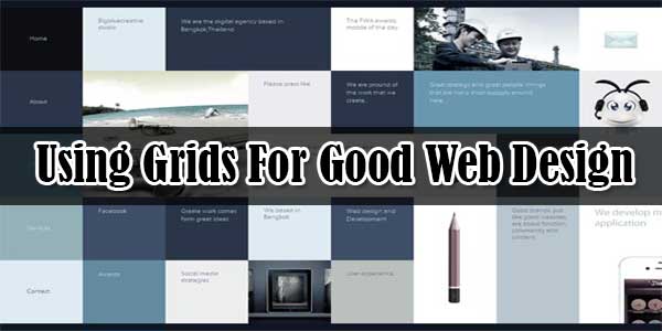
A grid is simply a set of lines that position different elements. Good designers tend to establish grids by aligning images and bodies of text consistently. The easy way to conceptualize grid alignment is to think of it as text in a word processor. When you type, each line of text is equidistant from the previous one. Each new paragraph is a consistent distance from the edge of the paper. Paragraphs with bullets and indents are indented even further, indicating a new sort of content, and creating an easytofollow hierarchy. Systematic grid systems originated with typography long ago and were later adopted by web designers.
2.) Grid Goals:
Using a grid helps you to simplify the design process by establishing grid zones for you to design within them. Planning even a loose grid before starting a design adds structure, and it can help you overcome designer’s block by providing some constraint over the white space. Grids also help accomplish these following goals:
3.) Organization:
Grids help organize a site into different functional areas. The site navigation is separated from the site content and footer information is separated from the main body. Grids help designers organize site content so users have an easier time finding what they look for.
4.) Segment Information:
Once your content is organized into specific areas, grids help subdivide content into more accessible blocks. Think of article previews on a news site or blog. Each preview is part of the “body content,” but it is subdivided into easily recognizable information subblocks.
5.) Establish Hierarchy:
Besides organizing site content, grids also help you in prioritizing content. Readers naturally jump to prominent design elements, like text headers and large buttons. When you establish a hierarchy that conforms to a grid, it helps site visitors navigate the content on a page.
6.) Create Balance:
A good grid will also add balance to a site, which makes it more overall more visually pleasing. Equally sized grid cells, once they are filled with content, will create unity in a website design. Consistency is the key. Grids should establish a consistent size for margins, padding and white space, along with content blocks that’s repeated throughout the design. If you have any difficulty understanding gridbased design, just browse your favorite websites to see how different blocks of content will consistently line up.
7.) Designing Around A Grid:
Whether you are an expert in HTML and CSS or never ventured past Photoshop, many of the prebuilt grid systems on the web may help you with your design process. You could also start from scratch and design your own grid. Whether you start from scratch or use a prebuilt grid, begin by sketching your site design around a grid using pen and paper before you use design software. This will give you a lot of help when you start designing your site according to a grid.
If you have some experience in HTML or CSS, it would be wise to design and develop simultaneously. This will help you to get a feel for the site and work out any kinks that you might run into later on. If you do not have experience in HTML and CSS, and you plan to use a web developer for production, you should consider including grids in the design process, especially if you’re starting from scratch with your grid system. Basic familiarity with HTML and CSS will help you design a gridbased site that is easily implemented.
8) Responsive Benefits:
Using a grid while designing from scratch can help create a responsive site that looks just as good on mobile devices as it will on desktops. At some point, this is going to require knowledge of HTML and CSS, but from a design standpoint, a basic way to design around a grid for responsive design is to think in general terms of stackability. If your desktop site is organized vertically, start with a header, and then navigation, followed by a content slider and then three columns of content. The last three columns of content could be restacked when the site is viewed by a mobile device while the rest of the site resizes.
9.) Popular Grid Systems:
There are many popular grid systems online. Hongkiat, Skeleton, Lemonade and the Golden Grid System are some to look at and evaluate.
10.) Grid Facelift:
If you have an existing site and it isn’t due for a complete redesign, you can give your site a “grid facelift” without having to redesign the entire site. Start first by determining if you really need to update your site. If your content consistently falls into neatly aligned blocks of content, you’re probably OK. But if you notice that blocks of your site are out of alignment, it should be just a simple task to realign them. Start with vertical lines and then repeat the process with horizontal ones. However, if your site seems too disorganized to be fixed by a simple grid, it may be time for a complete redesign.
 About the Author:I am Timm Danny, the editor Key Difference. Have a passionate about SEO service, technology, email marketing services, etc… I wish to share my knowledge with others and jump into blogging.


Dear Sir , I Also Want Grid Style For My Blogger , Because Its Easy to Use For Blog’s Viewers.
Yes, You Can. Just Follow Our Previous Article At Auto Image Thumbnail & ReadMore Link For Blogger Post And Its Done.