
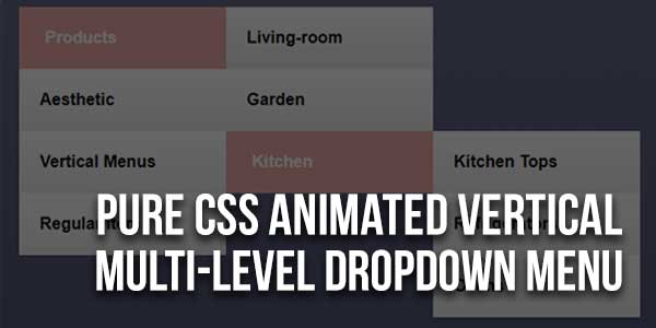
A CSS dropdown menu is an effective solution for enhancing the UI and UX of an app or website. A drop-down menu is a sub-menu of a website or app’s main menu. It is used to showcase content buttons (links) for each parent menu item.
Dropdown menus help users easily navigate an app or website by narrowing down their choices. CSS dropdown menus are ideal for building a website or app’s navigation bars, search bars, or tab bars.
There are many code snippets available online or on many other blogs and websites, but everyone cannot optimize your blog or website, so you need some optimized code snippets. So now checkout out the code snippet for your blog and website that will give you all features for your desired code. Now grab the ready-to-use code and paste it where you want.
Table of Contents
Features:
- Light Weight.
- Pure CSS.
- Cross Browser.
- No JQuery Files.
- Fully Customizable.
- Responsive.
How To Add Pure CSS Animated Vertical Multi-Level Dropdown Menu?
There are a few easy and understandable steps to achieve your desired functionality that we are gonna share below. Follow each step perfectly.
<style type="text/css">
html {
height: 100%;
}
body{
background-repeat: no-repeat;
background: linear-gradient(to bottom, rgba(96,108,136,1) 0%,rgba(63,76,107,1) 100%);
background-size: cover;
}

.navbar{
padding: 0px;
margin: auto;
list-style-type: none;
width: 200px;
position: relative;
}

.navbar li{
height: 60px;
font-weight: bold;
background: -webkit-linear-gradient(top, rgb(255, 255, 255) 0%, rgb(234, 234, 234) 100%);
position: relative;
z-index: 1;
}

.navbar ul{
visibility: hidden;
padding: 0px;
margin: 0px;
list-style-type: none;
position:absolute;
left:100%;
top:0;
width:100%;
opacity:0;
transition: transform 0.4s, opacity 0.4s;
transform: translateY(-60px);
}
.navbar a{
font-family: arial;
line-height: 60px;
display: block;
height: 100%;
transition: margin-left 0.2s;
text-decoration: none;
color: #000;
margin-left: 20px;
}
.navbar li:hover > a{
margin-left: 25px;
color: #fff;
}
.navbar li:hover > ul{
opacity: 1;
transform: translateX(0px);
visibility: visible;
}

.navbar li:hover{
background: #FFA7A7;
}
</style>
HTML:
<ul class="navbar">
<li><a href="#">Products</a>
<ul>
<li><a href="#">Living-room</a>
<ul>
<li><a href="#">Dining Tables</a></li>
<li><a href="#">Sofas</a></li>
</ul>
</li>
<li><a href="#">Garden</a></li>
<li><a href="#">Kitchen</a>
<ul>
<li><a href="#">Kitchen Tops</a></li>
<li><a href="#">Refrigerators</a></li>
<li><a href="#">Ovens</a></li>
</ul>
</li>
</ul>
</li>
<li><a href="#">Aesthetic</a>
<ul>
<li><a href="#">Vertical</a>
<ul>
<li><a href="#">Menus</a>
</li>
</ul>
</li>
</ul>
</li>
<li><a href="#">Vertical Menus</a>
<ul>
<li><a href="#">Are cool!</a></li>
</ul>
</li>
<li><a href="#">Regular Item</a></li>
</ul>
Customization:
No need to customize it. Just copy-paste. Rest edit the code as per comments and need.
Troubleshooting the Errors:
Do it with concentration and patience. Check your all steps again and all codes or scripts. If you find any error you can contact us anytime via comment or better via email, We are always here to help you.
Final Words:
That’s all we have. We hope that you liked this article. If you have any problem with this code in your template then feel free to contact us with a full explanation of your problem. We will reply to you as time allows us If you have any doubts or problems please comment below. We are happy to help you! If you liked this article, Don’t forget to share this with your friends so they can also take benefit from it and leave.


Be the first to write a comment.