
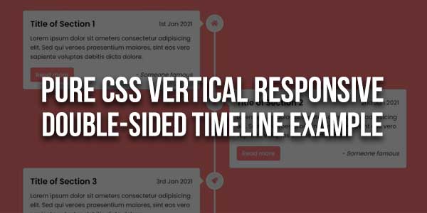
This CSS-only snippet by Bruno Rodrigues is great when you want to have a timeline on your site and the best part is that this is mobile-friendly. Each timeline entry has an icon and a chat bubble-like thing for the content.
There are many code snippets available online or on many other blogs and websites, but everyone cannot optimize your blog or website, so you need some optimized code snippets. So now checkout out the code snippet for your blog and website that will give you all features for your desired code. Now grab the ready-to-use code and paste it where you want.
Table of Contents
Features:
- Light Weight.
- Pure CSS.
- Cross Browser.
- No JQuery Files.
- Fully Customizable.
- Responsive.
How To Add Pure CSS Vertical Responsive Double-Sided Timeline Example?
There are a few easy and understandable steps to achieve your desired functionality that we are gonna share below. Follow each step perfectly.
<style type="text/css">
@import "https://fonts.googleapis.com/css?family=Dosis:300,400,500,600,700";
header:after, #timeline .timeline-item:after, header:before, #timeline .timeline-item:before {
content: '';
display: block;
width: 100%;
clear: both;
}
*, *:before, *:after {
box-sizing: border-box;
-webkit-box-sizing: border-box;
-moz-box-sizing: border-box;
}
body, html {
height: 100%;
}
body {
background: #f9f9f9;
background-size: cover;
margin: 0;
padding: 0;
font-family: helvetica, arial, tahoma, verdana;
line-height: 20px;
font-size: 14px;
color: #726f77;
}
img {
max-width: 100%;
}
a {
text-decoration: none;
}
.container {
max-width: 1100px;
margin: 0 auto;
}
h1, h2, h3, h4 {
font-family: "Dosis", arial, tahoma, verdana;
font-weight: 500;
}
.project-name {
text-align: center;
padding: 10px 0;
}
header {
background: #2b2e48;
padding: 10px;
-webkit-box-shadow: 0 3px 3px rgba(0, 0, 0, 0.05);
-moz-box-shadow: 0 3px 3px rgba(0, 0, 0, 0.05);
-ms-box-shadow: 0 3px 3px rgba(0, 0, 0, 0.05);
box-shadow: 0 3px 3px rgba(0, 0, 0, 0.05);
}
header .logo {
color: #ee4d4d;
float: left;
font-family: "Dosis", arial, tahoma, verdana;
font-size: 22px;
font-weight: 500;
}
header .logo > span {
color: #f7aaaa;
font-weight: 300;
}
header .social {
float: right;
}
header .social .btn {
font-family: "Dosis";
font-size: 14px;
margin: 10px 5px;
}
#timeline {
width: 100%;
margin: 30px auto;
position: relative;
padding: 0 10px;
-webkit-transition: all 0.4s ease;
-moz-transition: all 0.4s ease;
-ms-transition: all 0.4s ease;
transition: all 0.4s ease;
}
#timeline:before {
content: "";
width: 3px;
height: 100%;
background: #ee4d4d;
left: 50%;
top: 0;
position: absolute;
}
#timeline:after {
content: "";
clear: both;
display: table;
width: 100%;
}
#timeline .timeline-item {
margin-bottom: 50px;
position: relative;
}
#timeline .timeline-item .timeline-icon {
background: #ee4d4d;
width: 50px;
height: 50px;
position: absolute;
top: 0;
left: 50%;
overflow: hidden;
margin-left: -23px;
-webkit-border-radius: 50%;
-moz-border-radius: 50%;
-ms-border-radius: 50%;
border-radius: 50%;
}
#timeline .timeline-item .timeline-icon svg {
position: relative;
top: 14px;
left: 14px;
}
#timeline .timeline-item .timeline-content {
width: 45%;
background: #fff;
padding: 20px;
-webkit-box-shadow: 0 3px 0 rgba(0, 0, 0, 0.1);
-moz-box-shadow: 0 3px 0 rgba(0, 0, 0, 0.1);
-ms-box-shadow: 0 3px 0 rgba(0, 0, 0, 0.1);
box-shadow: 0 3px 0 rgba(0, 0, 0, 0.1);
-webkit-border-radius: 5px;
-moz-border-radius: 5px;
-ms-border-radius: 5px;
border-radius: 5px;
-webkit-transition: all 0.3s ease;
-moz-transition: all 0.3s ease;
-ms-transition: all 0.3s ease;
transition: all 0.3s ease;
}
#timeline .timeline-item .timeline-content h2 {
padding: 15px;
background: #ee4d4d;
color: #fff;
margin: -20px -20px 0 -20px;
font-weight: 300;
-webkit-border-radius: 3px 3px 0 0;
-moz-border-radius: 3px 3px 0 0;
-ms-border-radius: 3px 3px 0 0;
border-radius: 3px 3px 0 0;
}
#timeline .timeline-item .timeline-content:before {
content: '';
position: absolute;
left: 45%;
top: 20px;
width: 0;
height: 0;
border-top: 7px solid transparent;
border-bottom: 7px solid transparent;
border-left: 7px solid #ee4d4d;
}
#timeline .timeline-item .timeline-content.right {
float: right;
}
#timeline .timeline-item .timeline-content.right:before {
content: '';
right: 45%;
left: inherit;
border-left: 0;
border-right: 7px solid #ee4d4d;
}
.btn {
padding: 5px 15px;
text-decoration: none;
background: transparent;
border: 2px solid #f27c7c;
color: #f27c7c;
display: inline-block;
position: relative;
text-transform: uppercase;
font-size: 12px;
-webkit-border-radius: 5px;
-moz-border-radius: 5px;
-ms-border-radius: 5px;
border-radius: 5px;
-webkit-transition: background 0.3s ease;
-moz-transition: background 0.3s ease;
-ms-transition: background 0.3s ease;
transition: background 0.3s ease;
-webkit-box-shadow: 2px 2px 0 #f27c7c;
-moz-box-shadow: 2px 2px 0 #f27c7c;
-ms-box-shadow: 2px 2px 0 #f27c7c;
box-shadow: 2px 2px 0 #f27c7c;
}
.btn:hover {
box-shadow: none;
top: 2px;
left: 2px;
-webkit-box-shadow: 2px 2px 0 transparent;
-moz-box-shadow: 2px 2px 0 transparent;
-ms-box-shadow: 2px 2px 0 transparent;
box-shadow: 2px 2px 0 transparent;
}
@media screen and (max-width: 768px) {
#timeline {
margin: 30px;
padding: 0px;
width: 90%;
}
#timeline:before {
left: 0;
}
#timeline .timeline-item .timeline-content {
width: 90%;
float: right;
}
#timeline .timeline-item .timeline-content:before, #timeline .timeline-item .timeline-content.right:before {
left: 10%;
margin-left: -6px;
border-left: 0;
border-right: 7px solid #ee4d4d;
}
#timeline .timeline-item .timeline-icon {
left: 0;
}
}
</style>
HTML:
<div class="container">
<h1 class="project-name">RESPONSIVE TIMELINE</h1>
<div id="timeline">
<div class="timeline-item">
<div class="timeline-icon">
<svg version="1.1" id="Layer_1" xmlns="http://www.w3.org/2000/svg" xmlns:xlink="http://www.w3.org/1999/xlink" x="0px" y="0px"
width="21px" height="20px" viewBox="0 0 21 20" enable-background="new 0 0 21 20" xml:space="preserve">
<path fill="#FFFFFF" d="M19.998,6.766l-5.759-0.544c-0.362-0.032-0.676-0.264-0.822-0.61l-2.064-4.999
c-0.329-0.825-1.5-0.825-1.83,0L7.476,5.611c-0.132,0.346-0.462,0.578-0.824,0.61L0.894,6.766C0.035,6.848-0.312,7.921,0.333,8.499
l4.338,3.811c0.279,0.246,0.395,0.609,0.314,0.975l-1.304,5.345c-0.199,0.842,0.708,1.534,1.468,1.089l4.801-2.822
c0.313-0.181,0.695-0.181,1.006,0l4.803,2.822c0.759,0.445,1.666-0.23,1.468-1.089l-1.288-5.345
c-0.081-0.365,0.035-0.729,0.313-0.975l4.34-3.811C21.219,7.921,20.855,6.848,19.998,6.766z"/>
</svg>

</div>
<div class="timeline-content">
<h2>LOREM IPSUM DOLOR</h2>
<p>
Lorem ipsum dolor sit amet, consectetur adipisicing elit.
Atque, facilis quo maiores magnam modi ab libero praesentium blanditiis.
</p>
<a href="#" class="btn">button</a>
</div>
</div>

<div class="timeline-item">
<div class="timeline-icon">
<svg version="1.1" id="Layer_1" xmlns="http://www.w3.org/2000/svg" xmlns:xlink="http://www.w3.org/1999/xlink" x="0px" y="0px"
width="21px" height="20px" viewBox="0 0 21 20" enable-background="new 0 0 21 20" xml:space="preserve">
<g>
<path fill="#FFFFFF" d="M17.92,3.065l-1.669-2.302c-0.336-0.464-0.87-0.75-1.479-0.755C14.732,0.008,7.653,0,7.653,0v5.6
c0,0.096-0.047,0.185-0.127,0.237c-0.081,0.052-0.181,0.06-0.268,0.02l-1.413-0.64C5.773,5.183,5.69,5.183,5.617,5.215l-1.489,0.65
c-0.087,0.038-0.19,0.029-0.271-0.023c-0.079-0.052-0.13-0.141-0.13-0.235V0H2.191C1.655,0,1.233,0.434,1.233,0.97
c0,0,0.025,15.952,0.031,15.993c0.084,0.509,0.379,0.962,0.811,1.242l2.334,1.528C4.671,19.905,4.974,20,5.286,20h10.307
c1.452,0,2.634-1.189,2.634-2.64V4.007C18.227,3.666,18.12,3.339,17.92,3.065z M16.42,17.36c0,0.464-0.361,0.833-0.827,0.833H5.341
l-1.675-1.089h10.341c0.537,0,0.953-0.44,0.953-0.979V2.039l1.459,2.027V17.36L16.42,17.36z"/>
</g>
</svg>

</div>
<div class="timeline-content right">
<h2>LOREM IPSUM DOLOR</h2>
<p>
Lorem ipsum dolor sit amet, consectetur adipisicing elit. Atque, facilis quo. Maiores magnam modi ab libero praesentium blanditiis consequatur aspernatur accusantium maxime molestiae sunt ipsa.
</p>
<a href="#" class="btn">button</a>
</div>
</div>

<div class="timeline-item">
<div class="timeline-icon">
<svg version="1.1" id="Layer_1" xmlns="http://www.w3.org/2000/svg" xmlns:xlink="http://www.w3.org/1999/xlink" x="0px" y="0px"
width="21px" height="20px" viewBox="0 0 21 20" enable-background="new 0 0 21 20" xml:space="preserve">
<path fill="#FFFFFF" d="M19.998,6.766l-5.759-0.544c-0.362-0.032-0.676-0.264-0.822-0.61l-2.064-4.999
c-0.329-0.825-1.5-0.825-1.83,0L7.476,5.611c-0.132,0.346-0.462,0.578-0.824,0.61L0.894,6.766C0.035,6.848-0.312,7.921,0.333,8.499
l4.338,3.811c0.279,0.246,0.395,0.609,0.314,0.975l-1.304,5.345c-0.199,0.842,0.708,1.534,1.468,1.089l4.801-2.822
c0.313-0.181,0.695-0.181,1.006,0l4.803,2.822c0.759,0.445,1.666-0.23,1.468-1.089l-1.288-5.345
c-0.081-0.365,0.035-0.729,0.313-0.975l4.34-3.811C21.219,7.921,20.855,6.848,19.998,6.766z"/>
</svg>

</div>
<div class="timeline-content">
<h2>LOREM IPSUM DOLOR</h2>
<p>
Lorem ipsum dolor sit amet, consectetur adipisicing elit. Atque, facilis quo. Maiores magnam modi ab libero praesentium blanditiis consequatur aspernatur accusantium maxime molestiae sunt ipsa.
</p>
<a href="#" class="btn">button</a>
</div>
</div>
</div>
</div>
Customization:
No need to customize it. Just copy-paste. Rest edit the code as per comments and need.
Troubleshooting the Errors:
Do it with concentration and patience. Check your all steps again and all codes or scripts. If you find any error you can contact us anytime via comment or better via email, We are always here to help you.
Final Words:
That’s all we have. We hope that you liked this article. If you have any problem with this code in your template then feel free to contact us with a full explanation of your problem. We will reply to you as time allows us If you have any doubts or problems please comment below. We are happy to help you! If you liked this article, Don’t forget to share this with your friends so they can also take benefit from it and leave.


Thanks for sharing the CSS codes. I will give this a try.
Welcome here and thanks for reading our article and sharing your view. This will be very helpful to us to let us motivate to provide you with more awesome and valuable content from a different mind. Thanks again. Please contact us via the contact form for more info.