
There is some Good news from the Blogger Team on the Blogger Code Blog. If you have enabled the Mobile Templates, you will be able to customize the Blogger Mobile Template by using CSS definitions. You will also be able to control which widgets are to be shown and which shouldn’t. You can also configure the widgets to show an alternate content in the mobile view. Though this looks so promising, I was not able to test all of these features.
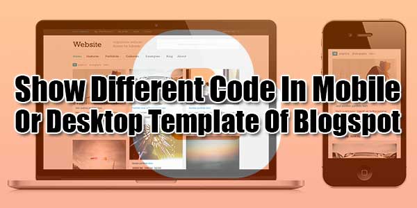
Enable Mobile Template: How To Open Blog Mobile Template For Blogspot/Blogger?
Customize Widget/Gadgets Of Template For Mobile/Desktop: How To Add/Remove Gadget/Widget To Your Mobile Blogspot Template?
If I use this tag, the attribution gadget will disappear from my desktop view, and will appear only on the mobile view. This code change will make the attribution widget disappear from your Mobile View.
Table of Contents
Preparation To Customizing Blogger Template For Mobile:
So if you want to enable your different codes on mobile blogger template and different code on your desktop blogger template then first you have to check your <head> section that is this code available there or not…
<b:include data='blog' name='all-head-content'/>
<meta content='width=device-width, initial-scale=1' name='viewport'/>
<meta content='IE=IE7; IE=IE8; IE=IE9; IE=IE10; IE=edge; chrome=1' http-equiv='X-UA-Compatible'/>
If available then its ok and if not then add it there. Now you can fully customize the looks of your mobile template but to write different CSS for mobile and desktop template, you have to check the <body> element of the mobile template too. Make sure that your template <body> tag is like below…
<body expr:class='"loading" + data:blog.mobileClass'>
If it is like above then good and if not then make it like that now.
Now Add Different Code For Mobile And Different For Desktop:
Once you switch to the Custom Mobile Template, you might find that the template is too huge to fit into a Mobile Browser. If you want, then you can provide alternate content inside a widget.
<div class="different-content">
<b:if cond="data:blog.isMobile">
<!-- Show Codes On Mobile Template -->
<b:else/>
<!-- Show Codes On Desktop Template-->
</b:if>
</div>
For a brief DEMO, just see the below code…
<div class="different-content">
<b:if cond="data:blog.isMobile">
<!-- Show a text link in mobile view -->
<a href="http://www.blogger.com">Powered By Blogger</a>
<b:else/>
<!-- Show an image link in desktop view -->
<a href="http://www.blogger.com"> <img expr:src="data:fullButton" alt="Powered By Blogger"/></a>
</b:if>
</div>
This will show a Powered by Blogger Text link on the Mobile View, and a Powered by Blogger image on the normal desktop view.
The condition <b:if cond="data:blog.isMobile"/> can be used to check if the viewer is viewing your blog in a mobile browser or not. You can use this conditional check creatively and give a totally different look to the mobile version of the blog. To know more about Blogger conditional tags, you can view our previous post at How To Display Codes On Your Desired Page/Post In Blogger?.
Now Add Different CSS For Mobile And Different CSS For Desktop:
Then, you can define different CSS properties for desktop and mobile view.
/* For Desktop Template */ .your_class_id {color:#FF0000;}
/* For Mobile Template */ .mobile .your_class_id {color:#0000FF;}
Mean if you want to add different CSS of a same HTML attr in desktop then add CSS to that attr normally but if you want to add different CSS for mobile on that attr then add .mobile just before your CSS attr as shared in above code.
Last Words:
This is what we have and shared in easy steps for newbies so that they can easily know how it works. Stay with us because we are going to share a whole guide step by step about Google Blogger/Blogspot and make it easy for you. If you liked it then share it and be with us to get next tutorial. If you have any problem then feel free to ask us. We will help you with what we can or have.


Thanks for sharing this. Now I’ve a good concept about it & this resource is helpful.
Welcome here and thanks for liking our article. Stay with us to get more like this…
This is what we have and shared in easy steps for newbies so that they can easily know how it works. Stay with us because we are going to share a whole guide step by step about Google Blogger/Blogspot and make it easy for you.
If you liked it then share it and be with us to get next tutorial. If you have any problem then feel free to ask us. We will help you with what we can or have.
Welcome here and thanks for reading our article and sharing your view. This will be very helpful to us to let us motivate to provide you with more awesome and valuable content from a different mind. Thanks again.