

As a translator, it can prove difficult when trying to explain a concept in any language. Languages are, by nature, complex, that is why all professional translators need tools that will facilitate better translations. Data visualization is one of the ways in which information/translations can be clearly explained. With the right data visualization tools, translating content becomes very easy.
Data visualization is the use of graphical representation to communicate information effectively. Humans are, by nature, visual creatures, with 65% of us being visual learners, therefore, making use of data visualization techniques to properly transit information is essential. A helpful analogy is using a network like Profitner affiliate network to help understand financial marketing, using tools like FusionCharts helps visualize data.
Below are the best data visualization tools for translators:
Table of Contents
1.) FusionCharts:
This is one of the most widely used data visualization tools. This JavaScript visualization package can produce 90 different types of charts and 960 maps, which can excellently serve any translator. It also integrates wonderfully with a wide variety of platforms giving you a lot of flexibility. It is, however, expensive when compared to other data visualization tools.
Tutorial:
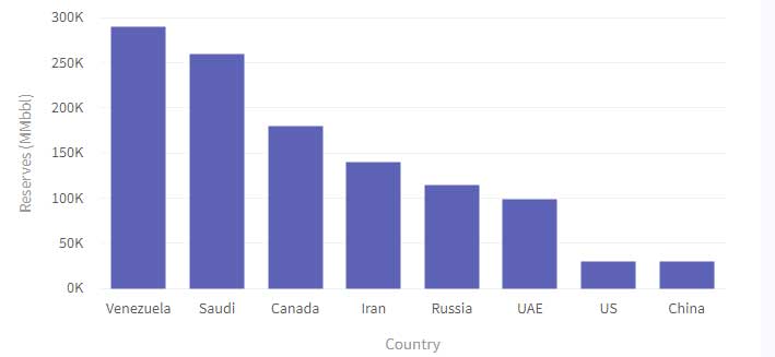
Below, we will be creating a 2D data visualization chart that shows the “countries with Most Oil Revenues.”
| Country | No. of Oil Reserves |
| Venezuela | 300K |
| Saudi | 260K |
| Canada | 180K |
| Iran | 140K |
| Russia | 115K |
| UAE | 100K |
| US | 30K |
| China | 30K |
Step 1: Label the “chart” object. When you do this, you are defining the chart elements.
Step 2: Label the title and subtitle of the chart. This is in the “caption” and “subscription.”
Step 3: Input the value for the name of the xAxis attributes, e.g., Countries. “xAxisName”
Step 4: Input the values for the name of the yAxis attributes e.g., Reserves “yAxisName”
Step 5: In the array “data,” input the objects for individual rows and also be specific about the “label” attribute you want the country to represent, e.g., USA
Step 6: In the “value,” specify the attributes. E.g., 290K for Saudi.
Step 7: The “numberSuffix” attribute needs to be set. This helps give the values Units.
Step 8: Set the attribute for “theme.”
In the Javascript Object Notation 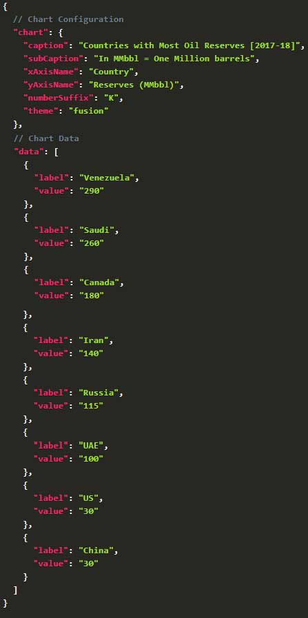
Render the Chart
Below are the following steps to help you render the above chart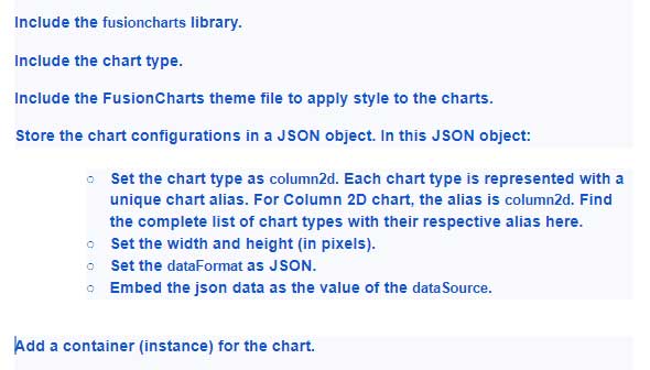
Pros of Fusion chart:
- Easy to use
- Has a wide variety of charts
- Very flexible and highly customizable
Cons of Fusion chart:
- Difficult to adapt to popular Content management systems e.g., word press.
- Very expensive to purchase.
2.) Tableau:
This tool is well equipped and easy to use for any translator. It allows you to create graphs, maps, charts, and a lot of other graphics. With a large customer base of over 57,000 accounts, it is regarded as one of the very best in tools in the data visualization industry.
This tool integrates beautifully with a lot of platforms and data-based solutions. With Tableau, you are sure to get high-quality graphics and visualizations, which will help translate your tasks as efficiently as possible.
Tutorial:
In this tutorial, we will be creating a Tableau Line Chart
Step 1: The year to be used needs to be dragged and dropped from Dimension Region to Column Shelf.
Step 2: The sales Amount needs to be dragged and dropped from “measure to “Region of Rows”.
Note: Once these steps are followed, the line chart will be generated. This is because the sales amount added up to a sum due to the fact that it is a measure of value.
If the line chart did not get generated, click on the “show me” tab which is located on the top right hand corner and select the line chart.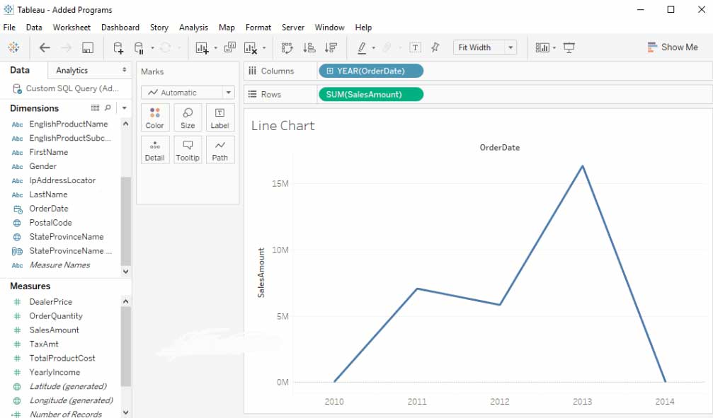
To add labels to this chart:
The sales amount needs to be dragged and released from “Measures Region” to “text field”. This is all present in the “Marks” shelf.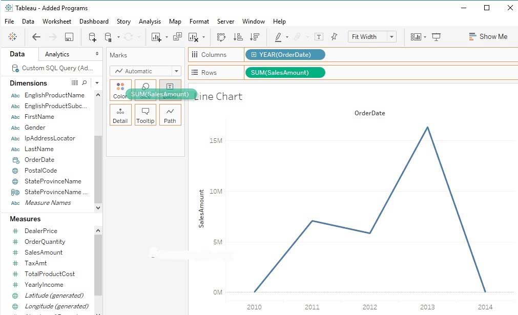
Below you will be able to see the number of sales on each point now.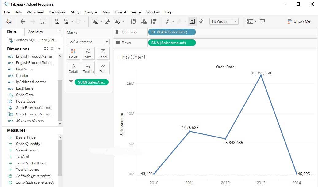
Pros of Tableau:
- It can connect with different data sources such as HADOOP, DB technologies, and SAP.
- It has an IOS and Android version, which helps with mobility.
- It has a lot of data visualization capabilities.
Cons of Tableau:
- A costly alternative.
- Horrible after-sales support
- Has security concerns
3.) Google Sheets:
This tool is compatible with a wide variety of platforms and browsers. It is also user-friendly and has a wide range of data visualization types. An efficient and interactive tool for translators that allows for dynamic data. Highly customizable and provides a set of configurable options to help match your needs. It is also free to use.
Tutorial:
Step 1: Name two columns on your google sheet. The first column should give the name of the category e.g., favorite Animal, while the second column should give the measurements taken e.g., Votes.
Step 2: Input the data set in the first column e.g., Horses, birds, etc
Step 3: Fill in the values in the second column e.g., 45%, 3%, etc
Note: if you are inputting values in terms of percentages, they should add up to 100 percent.
Step 4: Click the explore button once you finish inputting the data. This button is located at the lower right-hand corner of the screen.
Step 5: Click and drag the chart. You will see different suggestions of charts you might want to use when you scroll through, pick the one you want by dragging and dropping it on your screen.
Note: If the type of chart you want is not in the explore option, “Select all” the imputed data, then go “insert” and then “insert chart” and click and drag the chart.
Step 6: Customize the look. Click on the three dots at the top right-hand corner of the chart to customize the look.
Pros of Google Sheets:
- Very easy to use and understand
- Free of cost
Cons of Google Sheets:
- Only limited data visualization options are available
- Difficult to customize
4.) High Charts:
This tool has a reputable clientele list. According to their website, 72 of the world’s largest companies use this tool. It is easy to use and it does not require any training in specialist data visualization. It supports a lot of browsers and newer platforms. This tool, however, requires a license but has a free trial version for personal use.
Tutorial:
In this tutorial, we will be creating a bar chart.
Step 1: You will first need to add a “div” on your webpage.![]()
Step 2: Give your “div” a width, height, and ID. This height and width will determine how high and wide your graph is.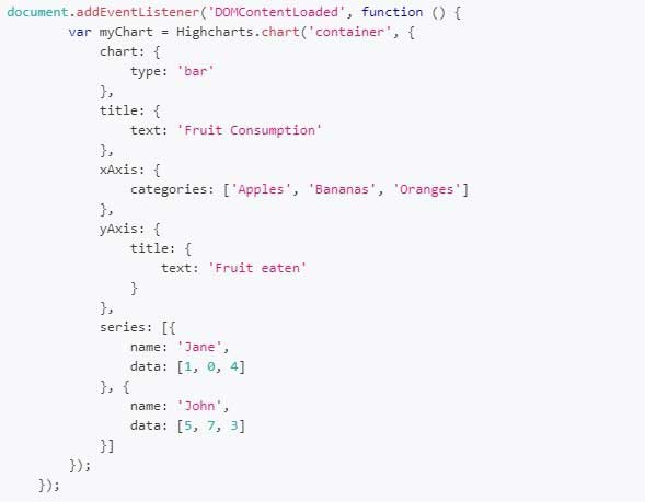
Step 3: After the javascript tag <script> </script> , has been added, the chart becomes initialized. This javascript tag can be added anywhere on the webpage. #1 is called the constructor.
If you followed the steps above, the chart would appear on the webpage.
Pros of High Charts:
- Excellent customer support
- You get good value for your money
- Has a lot of nice features
- Offers a free trial
- Easily ingests JSON and APIs
Cons of High Chart:
- Some functions such as drill-down are complicated to develop
- Not very customizable as compared to other visualization tools
5.) Datawrapper:
With this tool, creating charts and maps becomes an easy process. You can embed charts created with this tool on your website. The charts are also responsive and very interactive and allows you to create symbols, a locator map, or choropleth maps with ease.
This tool was built with journalists in mind, but translators can also get all the benefits it offers. It has a free version that only a single user can use; however, it allows for 10,000 monthly chart views.
Tutorial:
Step 1: You will have to input your data on a speed sheet. This can be google sheets, CSV files, and Excel.
Note: The inputted data must also be columns you want to visualize. The values also have to be plain with no commas, percentages, or symbols.
Step 2: Select all and then copy all the data on the sprees sheet.
Step 3: In your Datawrapper account, click on “+New Chart.”
Step 4: Paste the data from the speed sheet you copied onto the “new chart.”
Step 5: Click on “ upload and continue.”
Note: You will see that this software will automatically make the first column and row labels.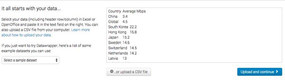
Step 6: Edit the data you imputed by clicking on the first square box in each column.
Step 7: Click on the “proceed” tab when you are satisfied with the data.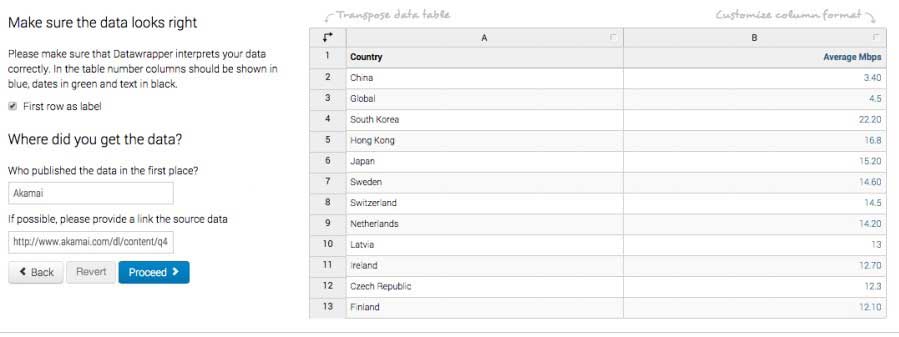
Note: After you click on proceed, you will see different chart options.
Step 8: Choose and click on the chat type you need.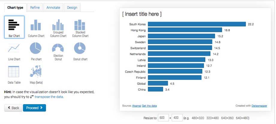
Step 9: Click on “Proceed.”
Note: You can customize the graph by clicking on “automatically sort bars,” “ Reverse order,” “use the same scale for all columns,” “ filter missing values.”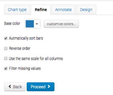
Step 10: Click on “proceed” or “ Annotate” to continue.
Note: If you clicked on “ Annotate,” you can fill in the title, description, highlight the vital elements, input the source name, and source URL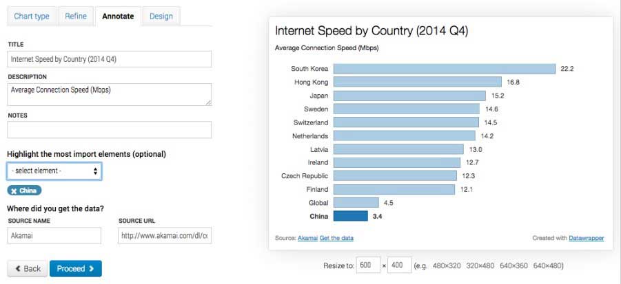
Step 11: Click on “publish.” This will take you to the last screen. Here you can make sure all the data is correct.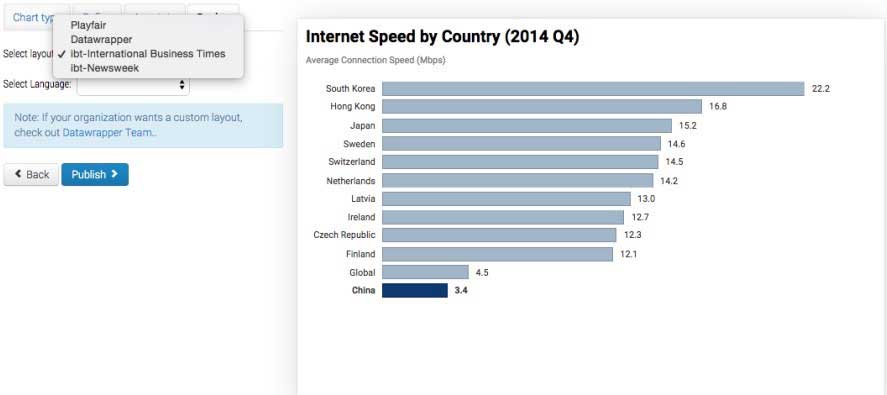
Step 12: Depending on what you want to do with the chart, you can click on any of the options. Click on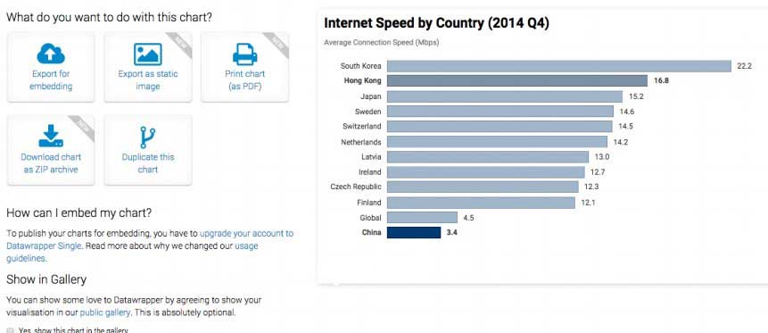
Pros of Datawrapper:
- Very easy to use, no need for any design skills or code
- It is free to use
- Has a reasonable variety of chart options
Cons of Datawrapper:
- Customization can prove difficult
- Can only access data on Datawrapper sever with the free plan.
Conclusion:
Just like using translation services like The Word Point or Google Translate to enhance translation using data visualization techniques to help explain a concept is a very effective way to transfer information. There are lots of data visualization tools available to translators, but keeping in mind things like needed features and ease of use helps pick the right tool. You can visit for more articles to help you as a translator.
 About the Author:
Gregory V. Chapman is passionate about researching new technologies in both mobile, web and WordPress. Also, he works on Best Writers Online the best writing services reviews. Gregory in love with stories and facts, so Gregory always tries to get the best of both worlds.


Be the first to write a comment.