
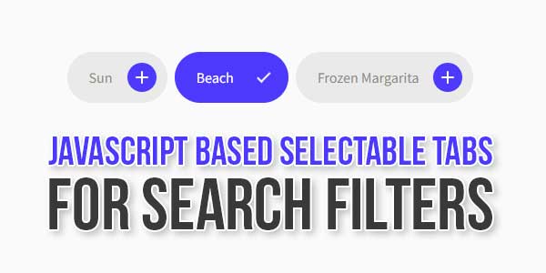
Do you want to add a list of labels and tags or categories to let your users search filters or in your forms with awesome animation with pure vanilla javascript?
There are many code snippets available online or on many other blogs and websites, but everyone cannot optimize your blog or website, so you need some optimized code snippets. So now checkout out the code snippet for your blog and website that will give you all features for your desired code. Now grab the ready-to-use code and paste it where you want.
Table of Contents
Features:
- Light Weight.
- Pure JavaScript.
- Cross Browser.
- No JQuery Files.
- Fully Customizable.
- Responsive.
How To Add JavaScript Based Selectable Tabs For Search Filters?
There are a few easy and understandable steps to achieve your desired functionality that we are gonna share below. Follow each step perfectly.
<style type="text/css">
.noSelect,
.cntr .pill,
.cntr .pill .pill-label,
.cntr .pill .pill-icon {
-webkit-user-select: none;
-moz-user-select: none;
-ms-user-select: none;
user-select: none;
}
.cntr {
left: 0;
width: 100%;
text-align: center;
display: flex;
justify-content: center;
}
.cntr .pill {
display: flex;
align-items: center;
justify-content: space-between;
flex-direction: row-reverse;
height: 3.5rem;
background: #eaeae9;
color: #8a8a87;
padding: 0 0.75rem 0 1.5rem;
margin-left: 0.5rem;
border-radius: 1.75rem;
overflow: hidden;
cursor: pointer;
transition: background-color 0.24s ease;
}
.cntr .pill:hover {
background-color: #e4ebff;
}
.cntr .pill:hover .pill-label {
color: #225cff;
}
.cntr .pill .pill-label {
position: relative;
transition: color 0.6s ease;
}
.cntr .pill .pill-icon {
position: relative;
width: 2rem;
height: 2rem;
margin-left: 1rem;
}
.cntr .pill .pill-icon:before,
.cntr .pill .pill-icon:after {
content: "";
position: absolute;
z-index: 9;
top: 50%;
left: 50%;
width: 0.875rem;
height: 0.125rem;
background: #fff;
border-radius: 0.25rem;
margin-left: -7px;
margin-top: -1px;
transform-origin: center;
transition: all 0.4s ease;
}
.cntr .pill .pill-icon:after {
transform: rotate(-90deg);
}
.cntr .pill .pill-icon .circle {
position: absolute;
width: 100%;
height: 100%;
background-color: #225cff;
border-radius: 100%;
transition: all 0.4s cubic-bezier(1, 0, 0, 1);
}
.selectedPill .pill-label {
color: #fff !important;
}
.selectedPill .pill-icon .circle {
transform: scale(15);
}
.selectedPill .pill-icon:before {
transform: rotate(135deg) translateX(-2px) translateY(-2px) !important;
}
.selectedPill .pill-icon:after {
transform: rotate(-135deg) translateX(-2px) translateY(-2px) !important;
width: 7px !important;
}

</style>
HTML:
<div class="cntr">
<div class="pill">
<div class="pill-icon">
<div class="circle"></div>
</div>
<div class="pill-label">Sun</div>
</div>

<div class="pill">
<div class="pill-icon">
<div class="circle"></div>
</div>
<div class="pill-label">Beach</div>
</div>

<div class="pill">
<div class="pill-icon">
<div class="circle"></div>
</div>
<div class="pill-label">Frozen Margarita</div>
</div>
</div>
JavaScript:
<script type="text/javascript">
document.querySelectorAll('.pill').forEach(element=>{
element.onclick = function toggleLabel() {
element.classList.toggle("selectedPill");
}
});
</script>
Customization:
No need to customize it. Just copy-paste. Rest edit the code as per comments and need.
Troubleshooting the Errors:
Do it with concentration and patience. Check your all steps again and all codes or scripts. If you find any error you can contact us anytime via comment or better via email, We are always here to help you.
Final Words:
That’s all we have. We hope that you liked this article. If you have any problem with this code in your template then feel free to contact us with a full explanation of your problem. We will reply to you as time allows us If you have any doubts or problems please comment below. We are happy to help you! If you liked this article, Don’t forget to share this with your friends so they can also take benefit from it and leave.


Be the first to write a comment.