
The bottom navigation bar breaks an interface into its core components and allows users to quickly and easily toggle between high-level functions. Its easily accessible and comfortable location makes it incredibly pervasive on mobile applications.
Nowadays, stylish bottom menus are in fashion in new web design and template to make it looks like a mobile app when user will open the web in mobile.
There are many code snippets available online or on many other blogs and websites, but everyone cannot optimize your blog or website, so you need some optimized code snippets. So now checkout out the code snippet for your blog and website that will give you all features for your desired code. Now grab the ready-to-use code and paste it where you want.
Table of Contents
Features:
- Light Weight.
- Pure HTML-CSS-JSCode.
- Cross Browser.
- No JQuery Files.
- Fully Customizable.
- Responsive.
How To Create Clean Responsive Fixed Bottom Mobile Navigation Menu Using JavaScript?
There are a few easy and understandable steps to achieve your desired functionality that we are gonna share below. Follow each step perfectly.
CSS:
<style type="text/css">
@import url("https://cdnjs.cloudflare.com/ajax/libs/material-design-icons/3.0.1/iconfont/material-icons.min.css");

* {
padding: 0;
margin: 0;
box-sizing: border-box;
list-style: none;
text-decoration: none;
-moz-osx-font-smoothing: grayscale;
-webkit-font-smoothing: antialiased;
text-rendering: optimizeLegibility;
}
body {
font-family: "Segoe UI", Tahoma, Geneva, Verdana, sans-serif;
font-size: 1rem;
font-weight: normal;
line-height: 1.5;
color: #252a32;
background: #ffffff;
}
.container {
max-width: 80rem;
width: 100%;
height: auto;
padding: 0 2rem;
margin: 0 auto;
}
.header .bottom-nav {
display: flex;
position: fixed;
bottom: 0;
left: 0;
right: 0;
padding: 0.8rem 0;
background-color: #252a32;
z-index: 99;
will-change: transform;
transform: translateZ(0);
box-shadow: 0 1px 3px rgba(0, 0, 0, 0.12), 0 1px 3px rgba(0, 0, 0, 0.24);
}
.header .bottom-nav-item {
display: flex;
flex-direction: column;
flex-grow: 1;
justify-content: center;
text-align: center;
font-size: 0.8rem;
color: #f1f5f8;
}
.header .bottom-nav-link {
display: flex;
flex-direction: column;
}
.header .bottom-nav .active {
color: #d32f2f;
}
</style>
JavaScript:
<script type="text/css">
var navItems = document.querySelectorAll(".bottom-nav-item");

navItems.forEach(function(e, i) {
e.addEventListener("click", function(e) {
navItems.forEach(function(e2, i2) {
e2.classList.remove("active");
});
this.classList.add("active");
});
});

</script>
HTML:
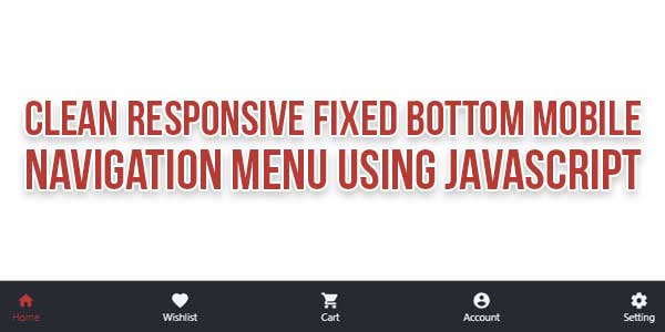
<header class="header">
<div class="container">
<nav class="bottom-nav">
<div class="bottom-nav-item active">
<div class="bottom-nav-link">
<i class="material-icons">home</i>
<span>Home</span>
</div>
</div>
<div class="bottom-nav-item">
<div class="bottom-nav-link">
<i class="material-icons">favorite</i>
<span>Wishlist</span>
</div>
</div>
<div class="bottom-nav-item">
<div class="bottom-nav-link">
<i class="material-icons">shopping_cart</i>
<span>Cart</span>
</div>
</div>
<div class="bottom-nav-item">
<div class="bottom-nav-link">
<i class="material-icons">account_circle</i>
<span>Account</span>
</div>
</div>

<div class="bottom-nav-item">
<div class="bottom-nav-link">
<i class="material-icons">settings</i>
<span>Setting</span>
</div>
</div>
</nav>
</div>
</header>
Customization:
No need to customize it. Just copy-paste. Rest edit the code as per comments and need.
Troubleshooting the Errors:
Do it with concentration and patience. Check your all steps again and all codes or scripts. If you find any error you can contact us anytime via comment or better via email, We are always here to help you.
Final Words:
That’s all we have. We hope that you liked this article. If you have any problem with this code in your template then feel free to contact us with a full explanation of your problem. We will reply to you as time allows us If you have any doubts or problems please comment below. We are happy to help you! If you liked this article, Don’t forget to share this with your friends so they can also take benefit from it and leave.


Your Blog is very nice.
Wish to see much more like this. Thanks for sharing your information.
Welcome here and thanks for reading our article and sharing your view. This will be very helpful to us to let us motivate to provide you with more awesome and valuable content from a different mind. Thanks again.