
You may have lot of requirement to display structured content in a HTML CSS. It could be an organization chart or a Sitemap of your site which you want to showcase to the users. Though no one does offer any default apps or elements so that you can easily add custom organization chart in web site but here you can have a full customized but plain and elegant style organization chart that is fully customizable too.
Warning: Due to the width of the chart, it may not be fitting in mobile devices. You can hide the chart on mobile devices and show listed text or an image instead.
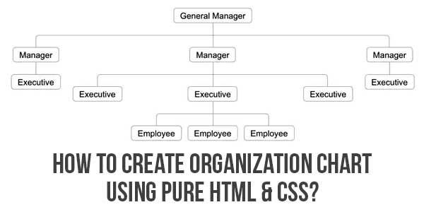
- Move mouse over any box to highlight the structure below that hierarchy.
- You can add any number of hierarchy levels both horizontally and vertically.
- Connectors will be automatically added for all levels of the tree.
- You can customize the color and fonts.
- Link each content box to individual page on your site or link to external site.
Table of Contents
Features:
- Light Weight.
- Pure HTML5-CSS3 Code.
- Cross Browser.
- No External Files.
- Fully Customizable.
- Plain And Elegant.
How To Create Organization Chart Using Pure HTML & CSS?
There are a few easy and understandable steps to achieve your desired functionality using pure CSS that we are gonna share below. Follow each step perfectly.
CSS:
<style type="text/css">
.org-chart ul {
padding-top: 20px;
position: relative;
transition: all 0.5s;
-webkit-transition: all 0.5s;
-moz-transition: all 0.5s;
}
.org-chart li {
float: left; text-align: center;
list-style-type: none;
position: relative;
padding: 20px 5px 0 5px;
transition: all 0.5s;
-webkit-transition: all 0.5s;
-moz-transition: all 0.5s;
}
.org-chart li::before, .org-chart li::after{
content: '';
position: absolute; top: 0; right: 50%;
border-top: 1px solid #ccc;
width: 50%; height: 20px;
}
.org-chart li::after{
right: auto; left: 50%;
border-left: 1px solid #ccc;
}
.org-chart li:only-child::after, .org-chart li:only-child::before {
display: none;
}
.org-chart li:only-child{ padding-top: 0;}
.org-chart li:first-child::before, .org-chart li:last-child::after{
border: 0 none;
}
.org-chart li:last-child::before{
border-right: 1px solid #ccc;
border-radius: 0 5px 0 0;
-webkit-border-radius: 0 5px 0 0;
-moz-border-radius: 0 5px 0 0;
}
.org-chart li:first-child::after{
border-radius: 5px 0 0 0;
-webkit-border-radius: 5px 0 0 0;
-moz-border-radius: 5px 0 0 0;
}
.org-chart ul ul::before{
content: '';
position: absolute; top: 0; left: 50%;
border-left: 1px solid #ccc;
width: 0; height: 20px;
}
.org-chart li a{
border: 1px solid #ccc;
padding: 5px 10px;
text-decoration: none;
color: #666;
font-family: arial, verdana, tahoma;
font-size: 11px;
display: inline-block;
border-radius: 5px;
-webkit-border-radius: 5px;
-moz-border-radius: 5px;
transition: all 0.5s;
-webkit-transition: all 0.5s;
-moz-transition: all 0.5s;
}
.org-chart li a:hover, .org-chart li a:hover+ul li a {
background: #c8e4f8; color: #000; border: 1px solid #94a0b4;
}
.org-chart li a:hover+ul li::after,
.org-chart li a:hover+ul li::before,
.org-chart li a:hover+ul::before,
.org-chart li a:hover+ul ul::before{
border-color: #808080;
}
</style>
HTML Examples:
<div class="org-chart">
<ul><li>
<a href="#">General Manager</a>
<ul><li>
<a href="#">Manager</a>
<ul><li>
<a href="#">Executive</a>
</li></ul></li><li>
<a href="#">Manager</a>
<ul><li>
<a href="#">Executive</a>
</li><li>
<a href="#">Executive</a>
<ul><li>
<a href="#">Employee</a>
</li><li>
<a href="#">Employee</a>
</li><li>
<a href="#">Employee</a>
</li></ul></li><li>
<a href="#">Executive</a>
</li></ul><li>
<a href="#">Manager</a>
<ul><li>
<a href="#">Executive</a>
</li></li></ul></li></ul>
</div>
Customization:
No need to customize it. Just copy-paste. Rest edit the code as per comments and need.
Troubleshooting the Errors:
Do it with concentration and patience. Check your all steps and again and all codes or scripts. If you find any error you can contact us anytime via comment or better via email, We are always here to help you.
Final Words:
That’s all we have. We hope that you liked this article. If you have any problem with this code in your template then feel free to contact us with a full explanation of your problem. We will reply to you as time allows us If you have any doubts and problems please comment below. We are happy to help you! If you liked this article, Don’t forget to share this with your friends so they can also take benefit from it and leave.


Be the first to write a comment.