
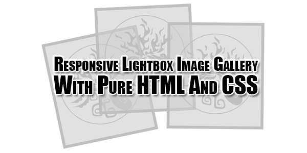
A simple, responsive galley lightbox for showcasing your favorite images, built using pure HTML and CSS. Clicking on the thumb will display all your images in a responsive, navigatable and closeable lightbox popup. THis sanippet is design by Cerealkillerway/css-lightbox
Now there are many snippet available online or on many others Blog and website but every one is not able to optimize your blog or website so your need some optimized code snippet. So now checkout out code snippet for your blog and website that will give you all features for your desired code. Now grab the ready to use code and paste it where you want.
Table of Contents
Features:
1.) No JQuery File Added.
2.) NO JavaScript File Added.
3.) CSS Added.
4.) Simple And Fast Loading Code.
5.) Can Work With Any Browser.
How To Add In A WebPage OR Blog?
1.) Just Go To Your “Web Page File” or “Blog”.
2.) Now “Copy” The Below Codes And “Paste” It To There Positions.
CSS:
<style>
.thumb {
  max-height: 171px;
  border: solid 6px rgba(5, 5, 5, 0.8);
}
.lightbox {
  position: fixed;
  z-index: 999;
  height: 0;
  width: 0;
  text-align: center;
  top: 0;
  left: 0;
  background: rgba(0, 0, 0, 0.8);
  opacity: 0;
}
.lightbox img {
  max-width: 90%;
  max-height: 80%;
  margin-top: 2%;
  opacity: 0;
}
.lightbox:target {
  /** Remove default browser outline */
  outline: none;
  width: 100%;
  height: 100%;
  opacity: 1 !important;
}
.lightbox:target img {
  border: solid 17px rgba(77, 77, 77, 0.8);
  opacity: 1;
  webkit-transition: opacity 0.6s;
  transition: opacity 0.6s;
}
.light-btn {
  color: #fafafa;
  background-color: #333;
  border: solid 3px #777;
  padding: 5px 15px;
  border-radius: 1px;
  text-decoration: none;
  cursor: pointer;
  vertical-align: middle;
  position: absolute;
  top: 45%;
  z-index: 99;
}
.light-btn:hover {
  background-color: #111;
}
.btn-prev {
  left: 7%;
}
.btn-next {
 right: 7%;
 }
.btn-close {
  position: absolute;
  right: 2%;
  top: 2%;
  color: #fafafa;
  background-color: #92001d;
  border: solid 5px #ef4036;
  padding: 10px 15px;
  border-radius: 1px;
  text-decoration: none;
}
.btn-close:hover {
  background-color: #740404;
}
</style>
HTML:
<a href="#img1">
  <img class="thumb" src="thumb-1.jpg">
</a>
<!-- lightbox container hidden with CSS -->
<div class="lightbox" id="img1">
  <a href="#img3" class="light-btn btn-prev">prev</a>
    <a href="#_" class="btn-close">X</a>
    <img src="images/1.jpg">
  <a href="#img2" class="light-btn btn-next">next</a>
</div>

<a href="#img2">
<img class="thumb" src="thumb-2.jpg">
</a>
<!-- lightbox container hidden with CSS -->
<div class="lightbox" id="img2">
  <a href="#img1" class="light-btn btn-prev">prev</a>
    <a href="#_" class="btn-close">X</a>
    <img src="2.jpg">
  <a href="#img3" class="light-btn btn-next">next</a>
</div>

<a href="#img3">
<img class="thumb" src="thumb-3.jpg">
</a>
<!-- lightbox container hidden with CSS -->
<div class="lightbox" id="img3">
  <a href="#img2" class="light-btn btn-prev">prev</a>
    <a href="#_" class="btn-close">X</a>
    <img src="3.jpg">
  <a href="#img1" class="light-btn btn-next">next</a>
</div>
Customization:
1.) You can change the Codes if your are a Pro. Rest can ask for customization.
Last Words:
That’s all we have. If you have any problem with this code in your template then feel free to contact us with full explanation of your problem. We will reply you as time allow to us. Don’t forget to share this with your friends so they can also take benefit from it and leave your precious feedback in our comment form below. Happy blogging, See you in next article…


Be the first to write a comment.