
The Counter JS is a lightweight JavaScript plugin to create an animated number counter. It uses the requestAnimationFrame() method to perform counting animation on given numbers. You need to pass the selector, starting & ending number, and duration of animation inside the function arguments and this plugin will animate the numbers.
There are many code snippets available online or on many other blogs and websites, but everyone cannot optimize your blog or website, so you need some optimized code snippets. So now checkout out the code snippet for your blog and website that will give you all features for your desired code. Now grab the ready-to-use code and paste it where you want.
Table of Contents
Features:
- Light Weight.
- Pure JavaScript.
- Cross Browser.
- No JQuery Files.
- Fully Customizable.
- Responsive.
How To Add Pure Vanilla JavaScript Base Animated Count Down Counter?
There are a few easy and understandable steps to achieve your desired functionality that we are gonna share below. Follow each step perfectly.
CSS:
<link rel="stylesheet" href="https://cdnjs.cloudflare.com/ajax/libs/twitter-bootstrap/4.1.3/css/bootstrap.min.css">
<style type="text/css">
body {
background-color: #000;
}

main{
background: #8E2DE2; /* fallback for old browsers */
background: -webkit-linear-gradient(to right, #4A00E0, #8E2DE2); /* Chrome 10-25, Safari 5.1-6 */
background: linear-gradient(to right, #4A00E0, #8E2DE2); /* W3C, IE 10+/ Edge, Firefox 16+, Chrome 26+, Opera 12+, Safari 7+ */
}
</style>
HTML:
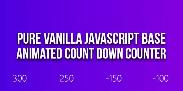
<main class="container py-5 text-white">
<div class="row justify-content-center text-center">
<div class="col-12">
<h1 class="pb-3 h5">Number counter animation
in pure JavaScript
(requestAnimationFrame) </h1>
</div>
<div class="col-md-3">
<span id="count1" class="display-4"></span>
</div>
<div class="col-md-3">
<span id="count2" class="display-4"></span>
</div>
<div class="col-md-3">
<span id="count3" class="display-4"></span>
</div>
<div class="col-md-3">
<span id="count4" class="display-4"></span>
</div>
</div>
</main>
JavaScript:
<script type="text/javascript">
//#region - start of - number counter animation
const counterAnim = (qSelector, start = 0, end, duration = 1000) => {
const target = document.querySelector(qSelector);
let startTimestamp = null;
const step = (timestamp) => {
if (!startTimestamp) startTimestamp = timestamp;
const progress = Math.min((timestamp - startTimestamp) / duration, 1);
target.innerText = Math.floor(progress * (end - start) + start);
if (progress < 1) {
window.requestAnimationFrame(step);
}
};
window.requestAnimationFrame(step);
};
//#endregion - end of - number counter animation

document.addEventListener("DOMContentLoaded", () => {
counterAnim("#count1", 10, 300, 1000);
counterAnim("#count2", 5000, 250, 1500);
counterAnim("#count3", -1000, -150, 2000);
counterAnim("#count4", 500, -100, 2500);
});
</script>
Customization:
No need to customize it. Just copy-paste. Rest edit the code as per comments and need.
Troubleshooting the Errors:
Do it with concentration and patience. Check your all steps again and all codes or scripts. If you find any error you can contact us anytime via comment or better via email, We are always here to help you.
Final Words:
That’s all we have. We hope that you liked this article. If you have any problem with this code in your template then feel free to contact us with a full explanation of your problem. We will reply to you as time allows us If you have any doubts or problems please comment below. We are happy to help you! If you liked this article, Don’t forget to share this with your friends so they can also take benefit from it and leave.


Be the first to write a comment.