
Building responsive navigations for mega sites is never an easy task. If you’re working on an admin panel, chances are you’ll need to design and develop a vertical menu, with plenty of sub-categories. That’s why we decided to share today’s snippet! Our Sidebar navigation can make your life easier by providing a starting, simple template for your next project 😉
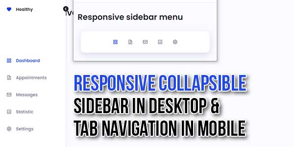
Learn how to collapse / expand a sidebar menu using JavaScript, HTML, & CSS only. In this tutorial, we will build a fully responsive sidebar menu that can be expanded and collapsed using a button. This is commonly seen on modern administration dashboards.
A responsive, mobile-friendly, collapsible/expandable sidebar & tab navigation written in plain JavaScript and CSS.
There are many code snippets available online or on many other blogs and websites, but everyone cannot optimize your blog or website, so you need some optimized code snippets. So now checkout out the code snippet for your blog and website that will give you all features for your desired code. Now grab the ready-to-use code and paste it where you want.
Table of Contents
Features:
- Light Weight.
- Pure JavaScript Code.
- Cross Browser.
- Desktop: Allows you to collapse the navigation into an icon-only side menu.
- Mobile: Automatically converts the sidebar nav into a bottom tab bar.
- No CSS/JS Files.
- Fully Customizable.
- Responsive.
How To Add Responsive Collapsible Sidebar In Desktop & Tab Navigation In Mobile?
There are a few easy and understandable steps to achieve your desired functionality that we are gonna share below. Follow each step perfectly.
CSS:
<style type="text/css">
@import "https://unpkg.com/boxicons@2.1.2/css/boxicons.min.css";

/*=============== VARIABLES CSS ===============*/
:root {
/*========== Colors ==========*/
/*Color mode HSL(hue, saturation, lightness)*/
--first-color: hsl(228, 81%, 49%);
--title-color: hsl(228, 12%, 15%);
--text-color: hsl(228, 8%, 50%);
--body-color: hsl(228, 100%, 99%);
--container-color: #fff;
/*========== Font and typography ==========*/
/*.5rem = 8px | 1rem = 16px ...*/
--body-font: 'Poppins', sans-serif;
--normal-font-size: .938rem;
}
/* Responsive typography */
@media screen and (min-width: 968px) {
:root {
--normal-font-size: 1rem;
}
}
/*=============== BASE ===============*/
* {
box-sizing: border-box;
padding: 0;
margin: 0;
}
body {
position: relative;
font-family: var(--body-font);
font-size: var(--normal-font-size);
background-color: var(--body-color);
color: var(--text-color);
}
a {
text-decoration: none;
}
/*=============== NAV ===============*/
.container {
margin-left: 1rem;
margin-right: 1rem;
}
.section {
padding: 2rem 0;
}
@media screen and (max-width: 767px) {
.nav__logo,
.nav__toggle,
.nav__name {
display: none;
}
.nav__list {
position: fixed;
bottom: 2rem;
background-color: var(--container-color);
box-shadow: 0 8px 24px hsla(228, 81%, 24%, .15);
width: 90%;
padding: 30px 40px;
border-radius: 1rem;
left: 0;
right: 0;
margin: 0 auto;
display: flex;
justify-content: center;
align-items: center;
column-gap: 36px;
transition: .4s;
}
}
.nav__link {
display: flex;
color: var(--text-color);
font-weight: 500;
transition: .3s;
}
.nav__link i {
font-size: 1.25rem;
}
.nav__link:hover {
color: var(--first-color);
}
/* Active link */
.active-link {
color: var(--first-color);
}
/*=============== BREAKPOINTS ===============*/
/* For small devices */
@media screen and (max-width: 320px) {
.nav__list {
column-gap: 20px;
}
}
/* For medium devices */
@media screen and (min-width: 576px) {
.nav__list {
width: 332px;
}
}
@media screen and (min-width: 767px) {
.container {
margin-left: 7rem;
margin-right: 1.5rem;
}
.nav {
position: fixed;
left: 0;
background-color: var(--container-color);
box-shadow: 1px 0 4px hsla(228, 81%, 49%, .15);
width: 84px;
height: 100vh;
padding: 2rem;
transition: .3s;
}
.nav__logo {
display: flex;
}
.nav__logo i {
font-size: 1.25rem;
color: var(--first-color);
}
.nav__logo-name {
color: var(--title-color);
font-weight: 600;
}
.nav__logo, .nav__link {
align-items: center;
column-gap: 1rem;
}
.nav__list {
display: grid;
row-gap: 2.5rem;
margin-top: 10.5rem;
}
.nav__content {
overflow: hidden;
height: 100%;
}
.nav__toggle {
position: absolute;
width: 20px;
height: 20px;
background-color: var(--title-color);
color: #fff;
border-radius: 50%;
font-size: 1.20rem;
display: grid;
place-items: center;
top: 2rem;
right: -10px;
cursor: pointer;
transition: .4s;
}
}
/* Show menu */
.show-menu {
width: 255px;
}
/* Rotate toggle icon */
.rotate-icon {
transform: rotate(180deg);
}
/* For 2K & 4K resolutions */
@media screen and (min-width: 2048px) {
body {
zoom: 1.7;
}
}
@media screen and (min-width: 3840px) {
body {
zoom: 2.5;
}
}
</style>
HTML:
<div class="nav" id="nav">
<nav class="nav__content">
<div class="nav__toggle" id="nav-toggle">
<i class='bx bx-chevron-right' ></i>
</div>
<a href="#" class="nav__logo">
<i class='bx bxs-heart' ></i>
<span class="nav__logo-name">Healthy</span>
</a>
<div class="nav__list">
<a href="#" class="nav__link active-link">
<i class='bx bx-grid-alt'></i>
<span class="nav__name">Dashboard</span>
</a>
<a href="#" class="nav__link">
<i class='bx bx-file'></i>
<span class="nav__name">Appointments</span>
</a>
<a href="#" class="nav__link">
<i class='bx bx-envelope' ></i>
<span class="nav__name">Messages</span>
</a>
<a href="#" class="nav__link">
<i class='bx bx-bar-chart-square' ></i>
<span class="nav__name">Statistic</span>
</a>
<a href="#" class="nav__link">
<i class='bx bx-cog' ></i>
<span class="nav__name">Settings</span>
</a>
</div>
</nav>
</div>
JavaScript:
<script type="text/javascript">
/*=============== LINK ACTIVE ===============*/
const linkColor = document.querySelectorAll('.nav__link')
function colorLink(){
linkColor.forEach(l => l.classList.remove('active-link'))
this.classList.add('active-link')
}
linkColor.forEach(l => l.addEventListener('click', colorLink))
/*=============== SHOW HIDDEN MENU ===============*/
const showMenu = (toggleId, navbarId) =>{
const toggle = document.getElementById(toggleId),
navbar = document.getElementById(navbarId)
if(toggle && navbar){
toggle.addEventListener('click', ()=>{
/* Show menu */
navbar.classList.toggle('show-menu')
/* Rotate toggle icon */
toggle.classList.toggle('rotate-icon')
})
}
}
showMenu('nav-toggle','nav')
</script>
Customization:
No need to customize it. Just copy-paste. Rest edit the code as per comments and need.
Troubleshooting the Errors:
Do it with concentration and patience. Check your all steps again and all codes or scripts. If you find any error you can contact us anytime via comment or better via email, We are always here to help you.
Final Words:
That’s all we have. We hope that you liked this article. If you have any problem with this code in your template then feel free to contact us with a full explanation of your problem. We will reply to you as time allows us If you have any doubts or problems please comment below. We are happy to help you! If you liked this article, Don’t forget to share this with your friends so they can also take benefit from it and leave.


Be the first to write a comment.