
This is a demo of shadow box widgets created using simple CSS. There’s a quick 1-line code that you can use right now to make your website prettier, and not many people know about it.
It’s called box-shadow. It can turn ugly websites into pieces of art. One of the reasons for sharing because I’m always interested in knowing how some websites make their box-shadow.
“box-shadow”? It’s a CSS rule that you can apply to any widget/element of your website (via Custom CSS if you’re using WordPress). It creates beautiful shadows on your elements, highlights elements, and creates depth in your design.
Developers use CSS to style the HTML documents. CSS describes how HTML pages should be visible over the screen. It saves a lot of time, as it can control layouts of multiple web pages at once. We can change and apply the color, font, and box-shadow to the element using CSS. Some CSS properties are crucial for providing a good user experience and interaction, and box-shadow is one. So this blog will cover some exciting CSS box-shadow examples that you will be going to love.
Table of Contents
What Is box-shadow?
The box-shadow is the CSS property that adds the shadow effect around the HTML element. It is described by colour, horizontal offset, vertical offset, blur, and spread radius. Multiple box-shadow effects can be set separated by commas.
box-shadow : {color} {horizontal offset} { vertical offset} {blur} { spread radius} {inset};- Color: It specifies the shadow color. The default color of the shadow is the text color.
- Horizontal-offset: Horizontal-offset or offset-x specifies the horizontal distance. If the value of the offset-x is positive, the shadow will be to the right of the box, and if the value is negative, then the shadow will be to the left of the box.
- Vertical-offset: Vertical-offset or offset-y specifies the vertical distance. If the value of the offset-y is positive, the shadow will be at the bottom of the box, and if the value is negative, then the shadow will be at the top of the box.
- Blur radius: The larger the blur radius value larger the blur, and the shadow becomes lighter and brighter. The negative values are not accepted. If not specified, the value is 0.
- Spread radius: It specifies how much the shadow should spread or not. The positive values increase the spread and make the shadow grow bigger, while the negative value makes the shadow shrink.
- Inset: If the inset keyword is not specified the shadow is assumed to be a drop shadow. And if specified the shadow changes to the one side of the frame.
Features:
- Light Weight.
- Pure CSS3 Code.
- Cross Browser.
- No External Files.
- Fully Customizable.
- Responsive.
How To Use Stylish CSS Shadow Boxes Widgets Using Pure CSS3?
There are a few easy and understandable steps to achieve your desired functionality using pure CSS that we are gonna share below. Follow each step perfectly.
CSS:
.box{background-color:#cddc39;color:#333;border-radius:0;-moz-border-radius:0;-webkit-border-radius:0px;box-shadow:none;-moz-box-shadow:none;-webkit-box-shadow:none;border:1px solid #ccc;margin:20px;padding:15px;font-size:18px}.shadow{position:relative;-webkit-box-sizing:border-box;-moz-box-sizing:border-box;box-sizing:border-box}.shadow:before{position:absolute;z-index:-1;display:block;background:rgba(0,0,0,.7);-webkit-box-shadow:0 0 20px 0 rgba(0,0,0,.7);-moz-box-shadow:0 0 20px 0 rgba(0,0,0,.7);box-shadow:0 0 20px 0 rgba(0,0,0,.7);content:""}.left-shadow:before{bottom:25px;left:20px;width:60%;height:20px;-webkit-box-shadow:0 20px 20px 0 rgba(0,0,0,.7);-moz-box-shadow:0 20px 20px 0 rgba(0,0,0,.7);box-shadow:0 20px 20px 0 rgba(0,0,0,.7);-webkit-transform:rotate(-3deg);-moz-transform:rotate(-3deg);-ms-transform:rotate(-3deg);-o-transform:rotate(-3deg);transform:rotate(-3deg)}.right-shadow:before{right:20px;bottom:25px;width:60%;height:20px;-webkit-box-shadow:0 20px 20px 0 rgba(0,0,0,.7);-moz-box-shadow:0 20px 20px 0 rgba(0,0,0,.7);box-shadow:0 20px 20px 0 rgba(0,0,0,.7);-webkit-transform:rotate(3deg);-moz-transform:rotate(3deg);-ms-transform:rotate(3deg);-o-transform:rotate(3deg);transform:rotate(3deg)}.bottom-shadow:before{right:20px;bottom:0;left:20px;height:30px;-webkit-border-radius:50%;-moz-border-radius:50%;border-radius:50%}.simple-shadow:before{right:20px;bottom:0;left:20px;height:30px}
HTML Examples:
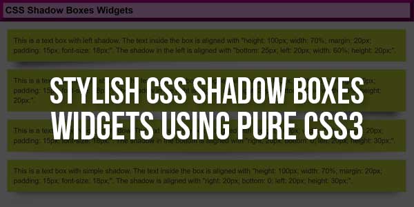
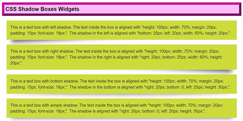
<div class="box shadow left-shadow">This is a text box with left shadow. The text inside the box is aligned with "height: 100px; width: 70%; margin: 20px; padding: 15px; font-size: 18px;". The shadow in the left is aligned with "bottom: 25px; left: 20px; width: 60%; height: 20px;".</div>

<div class="box shadow right-shadow">This is a text box with right shadow. The text inside the box is aligned with "height: 100px; width: 70%; margin: 20px; padding: 15px; font-size: 18px;". The shadow in the right is aligned with "right: 20px; bottom: 25px; width: 60%; height: 20px;".</div>

<div class="box shadow bottom-shadow">This is a text box with bottom shadow. The text inside the box is aligned with "height: 100px; width: 70%; margin: 20px; padding: 15px; font-size: 18px;". The shadow in the bottom is aligned with "right: 20px; bottom: 0; left: 20px; height: 30px;".</div>

<div class="box shadow simple-shadow">This is a text box with simple shadow. The text inside the box is aligned with "height: 100px; width: 70%; margin: 20px; padding: 15px; font-size: 18px;". The shadow is aligned with "right: 20px; bottom: 0; left: 20px; height: 30px;".</div>
Customization:
No need to customize it. Just copy-paste. Rest edit the code as per comments and need.
Troubleshooting the Errors:
Do it with concentration and patience. Check your all steps and again and all codes or scripts. If you find any error you can contact us anytime via comment or better via email, We are always here to help you.
Final Words:
That’s all we have. We hope that you liked this article. If you have any problem with this code in your template then feel free to contact us with a full explanation of your problem. We will reply to you as time allows us If you have any doubts and problems please comment below. We are happy to help you! If you liked this article, Don’t forget to share this with your friends so they can also take benefit from it and leave.


Be the first to write a comment.