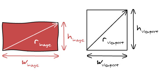
There are a couple of relatively new CSS measurement units called Viewport Percentage Lengths. The viewport-percentage lengths are relative to the size of the initial containing block. When the height or width of the initial containing block is changed, they are scaled accordingly.
These units are vh, vw, vmin and vmax. For this question, we can make use of vh (viewport height): 1vh is equal to 1% of the viewport height. That is to say, 100vh is equal to the height of the browser window, regardless of where the element is situated in the DOM tree…
Table of Contents
Features:
1.) Its Pure CSS.
2.) Supported By Major Browsers.
3.) Easy To Use.
4.) Will Fetch According To User Screen Size.
5.) Used In Maximum No Of CSS Codes.
Supported:
This is currently supported on all up-to-date major browsers apart from Opera Mini and Android Browser. Check out Can I Use… for further support.
How Is 100vh Different To 100%?
Some newbies want to know that why to use this? What’s new here? Take the below layout for example and see the difference yourself in the live code at JsFiddle DEMO.
<div id=”one” style=”height:50px”>
<p>100% Height</p>
</div>
<div id=”two” style=”height:50px”>
<p>100vh Height</p>
</div>
The p tag here is set to 100% height, but because its containing div has 200px height, 100% of 200px becomes 200px, not 100% of the body height. Using 100vh instead means that the p tag will be 100% height of the body regardless of the div height.
Viewport-Percentage Lengths: The ‘vw’, ‘vh’, ‘vmin’, ‘vmax’ Units:
The viewport-percentage lengths are relative to the size of the initial containing block. When the height or width of the initial containing block is changed, they are scaled accordingly. However, when the value of ‘overflow’ on the root element is ‘auto’, any scroll bars are assumed not to exist. Note that the initial containing block’s size is affected by the presence of scrollbars on the viewport.
vh unit = Equal to 1% of the height of the initial containing block.
vw unit = Equal to 1% of the width of the initial containing block.
vmin unit = Equal to the smaller of ‘vw’ or ‘vh’.
vmax unit = Equal to the larger of ‘vw’ or ‘vh’.
Examples/DEMOs:
- This is literally basic all that’s needed. Here is a JSFiddle example.
- In the case of the question at hand, featuring a left and a right divider, here is a JSFiddle example showing a two-column layout involving both vh and vw.


What You Think About my site .will My Site able to create CSS Cord (Css Reader ). Pls Tell Me …
http://www.ceylonwave.lk/
What You Want To Ask? Ask Briefly…???
I need Add my site to Rss Feeds .& also i need add my site to bog syndy s.
my site script create using PHP . give some advice pls. this is my site http://www.ceylonwave.lk/
What CMS/Platform Are You Using For Your Site.???