
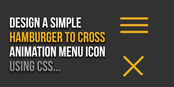
This code creates a hamburger-to-cross animation in CSS. The HTML sets up a navigation button, while the CSS styles the button and defines the animation properties. The JavaScript adds interactivity, toggling the ‘opened’ class on the button click, triggering the animation. Useful for enhancing user experience with a stylish navigation icon transition.
You can integrate this animated hamburger button to toggle the menu visibility. Furthermore, you can customize the size and color of the hamburger button according to your needs.
There are many code snippets available online or on many other blogs and websites, but everyone cannot optimize your blog or website, so you need some optimized code snippets. So now checkout out the code snippet for your blog and website that will give you all features for your desired code. Now grab the ready-to-use code and paste it where you want.
Table of Contents
Features:
- Light Weight.
- Pure CSS.
- Cross Browser.
- No External Files.
- Fully Customizable.
- Responsive.
How To Design A Simple Hamburger To Cross Animation Menu Icon Using CSS?
Here is the complete code to recognize speech using JavaScript code. There are a few easy and understandable steps to achieve your desired functionality that we are gonna share below. Follow each step perfectly.
CSS:
<style type="text/css">
.nav-toggle:focus {
outline-width: 0;
}

.nav-toggle [class*='bar-'] {
background: #E8AD1A;
display: block;
-webkit-transform: rotate(0deg);
transform: rotate(0deg);
-webkit-transition: .2s ease all;
transition: .2s ease all;
border-radius: 2px;
height: 2px;
width: 25px;
margin-bottom: 4px;
}

.nav-toggle .bar-bot {
margin-bottom: 0;
}

.opened .bar-top {
-webkit-transform: rotate(45deg);
transform: rotate(45deg);
-webkit-transform-origin: 15% 15%;
transform-origin: 15% 15%;
}
.opened .bar-mid {
opacity: 0;
}
.opened .bar-bot {
-webkit-transform: rotate(45deg);
transform: rotate(-45deg);
-webkit-transform-origin: 15% 95%;
transform-origin: 15% 95%;
}
</style>
HTML:
<nav>
<button class="nav-toggle">
<span class="bar-top"></span>
<span class="bar-mid"></span>
<span class="bar-bot"></span>
</button>
</nav>
JavaScript:
<script type="text/javascript">
(function () {
var toggle = document.querySelector('.nav-toggle');

toggle.addEventListener('click', function(e) {
this.classList.toggle('opened');
});
})();
</script>
When we execute the above code in the browser, it shows up like this in the browser. It allows you to access your microphone to speak something.
Customization:
No need to customize it. Just copy-paste. Rest edit the code as per comments and need.
Troubleshooting the Errors:
Do it with concentration and patience. Check your all steps again and all codes or scripts. If you find any error you can contact us anytime via comment or better via email, We are always here to help you.
Final Words:
That’s all we have. We hope that you liked this article. If you have any problem with this code in your template then feel free to contact us with a full explanation of your problem. We will reply to you as time allows us If you have any doubts or problems please comment below. We are happy to help you! If you liked this article, Don’t forget to share this with your friends so they can also take benefit from it and leave.


Be the first to write a comment.