
CSS is a beast, especially when you are in a learning phase, it is fun to practice different properties. CSS webkit animation properties are interesting to play around with for creating attractive animations for your site. This article will create a simple CSS rotating cube widget using keyframes.
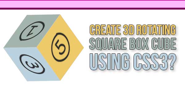
What is a Rotating Cube? The rotating cube will look like the below. You can showcase text or images on six faces of the cube and control the rotating speed so that the viewers can understand during rotation. For example, you can use your product images to showcase on the store page with each image linking to the corresponding product page.
Table of Contents
Features:
- Light Weight.
- Pure CSS3 Code.
- Cross Browser.
- No External Files.
- Fully Customizable.
- Responsive.
How To Create 3D Rotating Square Box Cube Using CSS3?
There are a few easy and understandable steps to achieve your desired functionality using pure CSS that we are gonna share below. Follow each step perfectly.
CSS:
<style type="text/css">
#box div
{
position: absolute;
height: 250px;
width: 250px;
border: 1px solid lightgrey;
background: rgba(255,200,100,0.8);
text-align: center;
font-size: 200px;
}

#box
{
-webkit-animation-name: animation;
-webkit-animation-timing-function: ease-in-out;
-webkit-animation-iteration-count: infinite;
-webkit-animation-duration: 6s;
margin:80;
-webkit-transform-style: preserve-3d;
-webkit-transform-origin: 125px 125px 0;
}

#box .one
{
-webkit-transform: translateZ(125px);
}
#box .two
{
-webkit-transform: rotateX(-90deg) translateZ(125px);
}
#box .three
{
-webkit-transform: rotateY(90deg) rotateX(90deg) translateZ(125px);
}
#box .four
{
-webkit-transform: rotateY(180deg) rotateZ(90deg) translateZ(125px);
}
#box .five
{
-webkit-transform: rotateY(-90deg) rotateZ(90deg) translateZ(125px);
}
#box .six
{
-webkit-transform: rotateY(90deg) translateZ(125px);
}

@-webkit-keyframes animation
{
from,to{}
16% { -webkit-transform: rotateY(-90deg);}
33% { -webkit-transform: rotateY(-90deg) rotateZ(135deg);}
50% { -webkit-transform: rotateY(225deg) rotateZ(135deg);}
66% { -webkit-transform: rotateY(135deg) rotateX(135deg);}
83% { -webkit-transform: rotateX(135deg);}
}
</style>
HTML:
<div id="view" style="width:350px; height:250px; margin:80px auto 0 auto;">
<div id="box">
<div class="one"><img src="https://img.webnots.com/2016/09/A-One.png"></div>
<div class="two"><img src="https://img.webnots.com/2016/09/B-Two.png"></div>
<div class="three"><img src="https://img.webnots.com/2016/09/C-Three.png"></div>
<div class="four"><img src="https://img.webnots.com/2016/09/D-Four.png"></div>
<div class="five"><img src="https://img.webnots.com/2016/09/E-Five.png"></div>
<div class="six"><img src="https://img.webnots.com/2016/09/F-Six.png"></div>
</div>
</div>
Customization:
No need to customize it. Just copy-paste. Rest edit the code as per comments and need.
You can customize the widget as per your need and below are some options:
- The box size is used as 250x250px and the translateZ is used with half of the width as 125px. If you want to change the box size, ensure to change both these parameters accordingly.
- Ensure to use the images having the same dimensions as that of the box. In this example, we have used 250x250px images on all sides of the box. You can also use any text instead of an image or text/image combination on different faces.
- The rotating speed is defined as 6 seconds in CSS as “-webkit-animation-duration: 6s;”. You can increase or decrease the rotation speed based on your need.
- Use the keyframe animation percentage values to change the transformation speed.
- The position of the box is defined using inline style in HTML code as 350px width, 250px height and 180px margin. You can adjust these values to position the cube properly on your webpage.
Troubleshooting the Errors:
Do it with concentration and patience. Check your all steps and again and all codes or scripts. If you find any error you can contact us anytime via comment or better via email, We are always here to help you.
Final Words:
That’s all we have. We hope that you liked this article. If you have any problem with this code in your template then feel free to contact us with a full explanation of your problem. We will reply to you as time allows us If you have any doubts or problems please comment below. We are happy to help you! If you liked this article, Don’t forget to share this with your friends so they can also take benefit from it and leave.


Be the first to write a comment.