
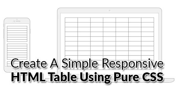
Tables are a nice way to display tabular information – like finance reports. Unfortunately, they are structured and designed with this in mind and come with some severe limitations in terms of what one can do with their layout. Still, large tables aren’t always a great experience on mobile screens. If not handled properly, columns can be cut off and thus unreadable. It just makes for a poor UX.
Responsive tables allow tables to be scrolled horizontally with ease. There are many types of tables on websites where content can vary as wildly as the approaches used to make them responsive. The tables I find most frustrating are comparison tables or normal content layout tables, there are really no comprehensive CSS based solutions for making these types of tables responsive.
We’re going to use “responsive design” principles (CSS @media queries) to detect if the screen is smaller than the maximum of our table. If it is, we’re going to reformat the table.
Overall this method offers so much flexibility that you might consider replacing all your content tables with these techniques. You can continue to add different themes and styles with ease in CSS and designers will be much more effective if they understand upfront what responsive tables are capable of.
Table of Contents
How To Create A Simple Responsive HTML Table Using Pure CSS?
Tables are a nice way to organize a lot of data. We provide a few utility classes to help you style your table as easily as possible. Also, to improve mobile experience, all tables on mobile-screen widths are centered automatically. Responsive design is all about adjusting designs to accommodate screens of different sizes. This table is great for displaying large sets of information, there is no JS code, only CSS. It’s very clear, minimalistic.
HTML:
body {
font-family: "Open Sans", sans-serif;
line-height: 1.25;
}

table {
border: 1px solid #ccc;
border-collapse: collapse;
margin: 0;
padding: 0;
width: 100%;
table-layout: fixed;
}

table caption {
font-size: 1.5em;
margin: .5em 0 .75em;
}

table tr {
background-color: #f8f8f8;
border: 1px solid #ddd;
padding: .35em;
}

table th,
table td {
padding: .625em;
text-align: center;
}

table th {
font-size: .85em;
letter-spacing: .1em;
text-transform: uppercase;
}

@media screen and (max-width: 600px) {
table {
border: 0;
}

table caption {
font-size: 1.3em;
}

table thead {
border: none;
clip: rect(0 0 0 0);
height: 1px;
margin: -1px;
overflow: hidden;
padding: 0;
position: absolute;
width: 1px;
}

table tr {
border-bottom: 3px solid #ddd;
display: block;
margin-bottom: .625em;
}

table td {
border-bottom: 1px solid #ddd;
display: block;
font-size: .8em;
text-align: right;
}

table td::before {
/*
* aria-label has no advantage, it won't be read inside a table
content: attr(aria-label);
*/
content: attr(data-label);
float: left;
font-weight: bold;
text-transform: uppercase;
}

table td:last-child {
border-bottom: 0;
}
}
CSS:
<table>
<caption>Statement Summary</caption>
<thead>
<tr>
<th scope="col">Account</th>
<th scope="col">Due Date</th>
<th scope="col">Amount</th>
<th scope="col">Period</th>
</tr>
</thead>
<tbody>
<tr>
<td data-label="Account">Visa - 3412</td>
<td data-label="Due Date">04/01/2016</td>
<td data-label="Amount">$1,190</td>
<td data-label="Period">03/01/2016 - 03/31/2016</td>
</tr>
<tr>
<td scope="row" data-label="Account">Visa - 6076</td>
<td data-label="Due Date">03/01/2016</td>
<td data-label="Amount">$2,443</td>
<td data-label="Period">02/01/2016 - 02/29/2016</td>
</tr>
<tr>
<td scope="row" data-label="Account">Corporate AMEX</td>
<td data-label="Due Date">03/01/2016</td>
<td data-label="Amount">$1,181</td>
<td data-label="Period">02/01/2016 - 02/29/2016</td>
</tr>
<tr>
<td scope="row" data-label="Acount">Visa - 3412</td>
<td data-label="Due Date">02/01/2016</td>
<td data-label="Amount">$842</td>
<td data-label="Period">01/01/2016 - 01/31/2016</td>
</tr>
</tbody>
</table>
Explanation:
This is just one potential solution to the problem of data tables on small screens. There are likely some fancy JavaScript solutions that could approach things differently and also work great.
Customization:
You can change anything in the upper code if you are pro else we do not recommend you to edit the code as it may break while executing and can cause fatal errors to your server.
Troubleshooting the Errors
Do it with concentration and patience. Check your alls steps and again and all codes or scripts. If you find any error you can contact us anytime via comment or better via email, We are always here to help you.
Final Words:
That’s all we have. We hope that you liked this article. If you have any problem with this code in your file then feel free to contact us with a full explanation of your problem. We will reply to you as time allows us or If you have any doubts and problems please comment below. We are happy to help you! If you liked this article, Don’t forget to share this with your friends so they can also take benefit from it and leave your precious feedback in our comment form below. Happy development, See you in the next article.


Hello,
It’s really help full thank you for sharing the informative post
Welcome here and thanks for reading our article and sharing your view. This will be very helpful to us to let us motivate to provide you more awesome and valuable content from a different mind. Thanks for reading this article.
Can I use this css to my project? What is the license?
Welcome here and thanks for reading our article and sharing your view. This will be very helpful to us to let us motivate to provide you with more awesome and valuable content from a different mind. Thanks again.
Welcome here and thanks for reading our article and sharing your view. This will be very helpful to us to let us motivate to provide you with more awesome and valuable content from a different mind. Thanks for reading this article.
Welcome here and thanks for reading our article and sharing your view. This will be very helpful to us to let us motivate to provide you with more awesome and valuable content from a different mind. Thanks again.