
“I decided to take a calligraphy class to learn how to [learn calligraphy]. I learned about serif and sans-serif typefaces, about varying the space between different letter combinations, about what makes great typography great. It was beautiful. Historical. Artistically subtle in a way that science can’t capture. And I found it fascinating.”
(Steve Jobs)
If you still think that typography is something of secondary importance on your website, think twice. Even better: read about Steve Job’s experience of taking calligraphy class without any hope of applying this knowledge to life, which anyway shaped the way this text looks on the screen now. Indeed, that course was crucial giving the world the first Mac computer with beautiful typography.
Typography is the face and appearance of a website. Well, if a site is a sweet, typography is a sweet wrapper. Just looking at it, you subconsciously decide if you want to buy it. It gives away an awful lot about the site, its owner and designer. It tells the users even more than we intended. Its final impact makes you visitors stay on the site or want to leave it.
Since we have been given some interesting UX tools to play around on our sites recently, we need to learn to be responsible for their use. Nowadays modern website builders like MotoCMS have special extended functionality allowing users to add, edit and delete fonts inside their admin panels. Definitely, such freedom opens the door to creativity of all kinds. And it is just unwise not to use such a brilliant opportunity to interfere with typography style having such tools, because it can make flat and boring looking content look appealing. But, one can go to extremes and the wrong implementing of typography might ruin everything. So, let’s find out what really matters when choosing a typography.
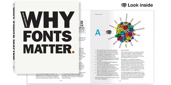
Table of Contents
Font’s Legibility:
Using the font of right size and color shows you bear your readers in mind and want to make your website user-friendly. It ensures the visitors smooth navigation through flow of data, leading them to making a decision in favor of your business.

Beautiful typography increases and holds users’ attention and consequently improves the site’s efficiency. Definitely, you should avoid small fonts and low-contrast text color as well as poor letter spacing and fonts where some letter are difficult to distinguish from each other. If your visitor drops reading or skips large passages, your design simply doesn’t work. Type must be large enough to be readable and there must be enough space between the lines so the text doesn’t look cramped. The most comfortable font size in terms of readability remains 1.5. The good rule for line length is 50-75 characters. As for contrast, the higher it is, the harder your content is to read, because it might be very tiring for eyes. So different shades of grey are preferred to solve the problem.
Typography Coherence:
It’s essential for the text to be accepted as a single consistent unit to ensure your readers’ smooth navigation experience. It’s no good when reader’s eye stumble over too big spaces between words as well as illogical layout of paragraphs. There is no need to apply fonts of different size to random parts of your content even if you think it’s important. Another thing that prevents from natural flow of readers’ attention is color overuse in font. Perfect typography means clear and effective communication. Mind that the general impression should be neat, harmonious and integral like in this example.
Determining User’s Behavior:
Competently chosen typography can affect user’s behavior in a positive way especially when it comes to e-commerce. The text becomes a form of visual language and the voice of your webpage able to affect consumers’ feelings and lead them to action. No need to say that such influence should be subtle, indirect and unconscious. Slight changes in typefaces lead to change in a user’s perception. Therefore, font manages the feelings and behavior leading users to purchase. Such effect can be achieved by different means like font color or capitalization that influences specific decisions. If you have an online store, the font you choose should be understood at a glance. Things are different if you intend to tell a captivating story, and thus choose most legible typography holding attention throughout the whole reading.
Typography Hierarchy:
Good visual organization of content is crucial for your website. And font plays the role of cement holding the text together. Headers, subheaders, navigation, buttons and body text may follow the same style. But you can also combine two font styles in case they really work well together. However, breaking the hierarchy might cause the effect quite opposite to the one you expected. So check the possible effect of pairing different fonts and their compatibility on the web. The same refers to randomly used color throughout the text or length and height of lines.
Emphasizing Personality:
Choice of font extensively depends on how your readers’ goals coincide with yours, whether they want to have a good shopping experience, to be entertained or be learned something. Taking into consideration that designers use different fonts to convey age, mood and even gender, no wonder that it can be used as a means of conveying the website owner’s personality. The same is relevant to brand identity. Specific font can become recognizable as a part of brand. No doubt, the font should be in one line with the style, language and mode of your business. You can go for any font style that conveys the same feel as your company – bold, calm or exquisite – depending on your niche.
Definitely, the typography issue is a question of manner and matter. The outside attracts, but the inside (your content) matters. Feel free to play around with types, create something beautiful and remarkable to look at. But if you have selected the typography correctly, it’s only half the battle. Make sure you text is equally appealing and engaging to accomplish the purposes of your business.
 About the Author:
Allison Reed is a professional content strategist and an inspired author. Marketing manager by day and a writer by night, she is creating many articles on business, design, web development and SEO. She loves working with multiple website builders and sharing her experience with the readers.


Thanks for sharing this article , interesting one. Hopes more like this from you.
Welcome here and thanks for reading our article and sharing your view.
I never thought fonts are that important, had no idea. From now on I will pay special attention to fonts. Thanks for sharing!
Welcome here and thanks for reading our article and sharing your view.