

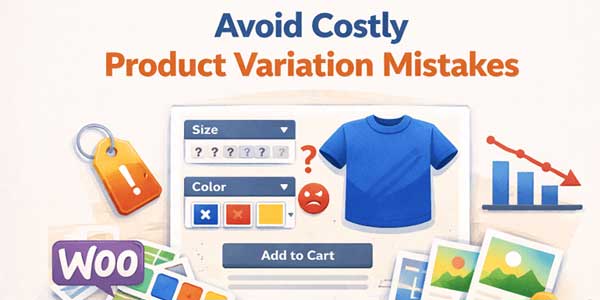
Product variations look simple on the surface. A few sizes. Some colors. Maybe material options. Yet this is one of the most common places where e-commerce stores quietly lose sales without realizing it. Customers do not complain. They leave. And the store owner often assumes price or traffic was the issue.
In reality, many drop-offs happen right on the product page. Right when a shopper is trying to choose between options, something feels off. Confusing labels. Hard to read dropdowns. Choices that reset themselves. These small issues stack up.
This is where variation swatches for WooCommerce start to matter more than most store owners expect. They are not a design extra. They fix very real usability mistakes that cost money.
Table of Contents
Relying On Dropdown Menus For Everything:
Dropdowns were never built for visual decision making. They work fine for country lists or quantities. They struggle badly when used for colors, patterns, or styles. A shopper clicks a dropdown. Scrolls through text options. Tries to imagine what Navy Blue means compared to Midnight Blue. Then closes the dropdown. That pause is hesitation.
Many stores still rely on dropdowns because they are the default. That default choice often becomes a silent sales killer. Customers want to see options, not decode them. Variation swatches for WooCommerce replace text with visible choices. Color swatches look like colors. Image swatches show the actual product variation. The choice becomes intuitive instead of mental.
This shift reduces friction immediately. Less thinking. More action.
Hiding Unavailable Variations Without Explanation:
Another common mistake is hiding options when they go out of stock. On paper, this sounds clean. In practice, it creates confusion. A shopper may have seen a color earlier. Comes back later. Suddenly, it is gone. No explanation. They wonder if they imagined it. Or assume the store is unreliable.
Showing disabled options with a clear visual state works better. It communicates honesty. This option exists but is currently unavailable. WooCommerce variations radio buttons help here by making all options visible at once. Customers understand the full range, even if they cannot select everything.
Transparency builds trust even when inventory is limited.
Making Variation Labels Unclear Or Inconsistent:
Small wording issues cause big confusion. One product says Small, Medium, Large. Another says S, M, L. Another mixes numbers and words. Customers notice inconsistency even if they cannot articulate it. It slows them down. It makes the store feel less polished.
Using variation swatches for WooCommerce encourages consistency because options are designed visually. Labels become secondary. The visual cue carries the meaning. This is especially helpful for stores with large catalogs. Visual consistency scales better than text-heavy layouts.
Forcing Customers To Reselect Options Repeatedly:
Few things frustrate shoppers more than selections resetting. Change color and size resets. Change size and color resets. It feels broken even if it technically works. This usually happens when variations are poorly structured. Dropdown-based setups are especially prone to this issue.
WooCommerce variations radio buttons keep selections visible and persistent. Customers can see what is selected at all times. Nothing disappears unexpectedly. This stability reduces frustration. It keeps the momentum going. Momentum is fragile on product pages.
Ignoring Mobile Behavior Completely:
Many variation issues only show up on mobile. Dropdowns that feel acceptable on desktops become painful on small screens. Tiny text. Hard to tap. Accidental selections. Backtracking. All of this adds friction.
Variation swatches for WooCommerce are more mobile-friendly by nature. Large tappable areas. Clear visual feedback. Fewer taps needed. Mobile shoppers are impatient. They do not troubleshoot. If selection feels annoying, they leave.
Fixing variations often improves mobile conversion more than homepage redesigns.
Overloading Customers With Too Many Options At Once:
Some stores show every possible combination without structure. Ten colors. Eight sizes. Multiple styles. It becomes overwhelming. The issue is not having many options. The issue is how they are presented.
Visual grouping through swatches helps customers scan choices faster. The brain processes visuals more quickly than text lists. WooCommerce variations radio buttons allow better spacing and layout. Choices feel organized instead of chaotic.
This helps customers move forward instead of freezing.
Using Generic Placeholder Images For Variations:
When variation images do not change, customers lose confidence. They select a color and see the same image. They wonder if the change actually happened. This is especially damaging for apparel and decor products where appearance matters most.
Variation swatches for WooCommerce work best when paired with proper variation images. Each selection feels real. The product updates visually. This reassurance reduces returns, too. Customers know what they are buying.
Forgetting Accessibility And Clarity:
Color alone is not always enough. Some customers are color blind. Others shop in poor lighting. Relying only on subtle color differences can backfire. Good swatch setups include borders, labels, or tooltips. Clarity matters more than minimalism.
WooCommerce variations radio buttons can include clear labels while still staying visual. This balances design with usability. Accessibility is not just a compliance checkbox. It directly affects sales.
Assuming Customers Will Figure It Out:
This is perhaps the biggest mistake. Assuming users will adapt. They rarely do. Customers compare your store to the best experience they have had elsewhere. Not to your intentions. If selection feels harder than expected, they move on.
Variation swatches for WooCommerce reduce the learning curve. No instructions needed. The interface explains itself. Good design disappears. Bad design demands attention.
Why Fixing Variations Often Feels Like Instant Growth:
Many store owners report sales increases after fixing variations without changing traffic. That feels surprising until you realize how central selection is. The product page is the decision point. Variations sit at the heart of that decision.
WooCommerce variations, radio buttons, and swatches remove doubt. They reduce friction. They keep customers moving. These are not flashy changes. They are quiet improvements that compound over time.
Final Thoughts On Variation Mistakes:
Product variations are not a minor detail. They are a core part of the buying experience. When they confuse or frustrate customers, sales quietly leak away. Most of these mistakes come from relying on defaults and not revisiting them as the store grows. Dropdowns work until they do not.
Variation swatches for WooCommerce exist because stores outgrow basic setups. They solve problems that only appear at scale. Fixing variation presentation is not about style. It is about clarity. And clarity is one of the strongest drivers of conversion in e-commerce.
When choices feel easy, customers feel confident. When customers feel confident, they buy.
 About the Author:
I’m Jeff Harrison. I’ve spent years writing about WooCommerce, mostly by testing plugins hands-on, including plugins like the Variation Swatches for WooCommerce and other add-ons that make stores easier to manage. I focus on real features, pricing, and how things actually work once installed, not just the marketing talk. The idea is to help store owners figure out whether a plugin is genuinely useful or just another install they’ll regret later.


Be the first to write a comment.