
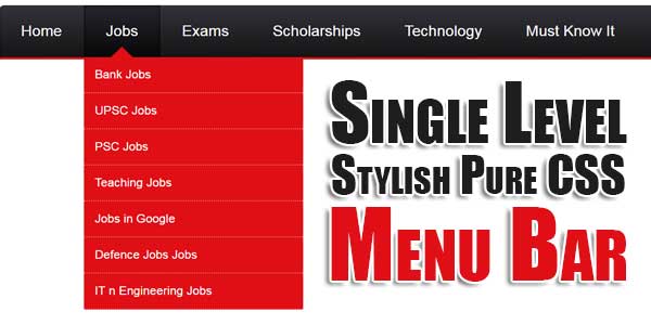
Menu Bar is a important widget for every blog and website to show their most used links on your every page to make your visitor happy to go to their desired page directly easily.
But there are many links to display so your menu bar will be lengthy and that will look odd so add this Single Level Stylish Pure CSS Menu Bar to add more links in less size. So use our stylish Single Level Stylish Pure CSS Menu Bar for your blogs and web pages to add more and more links in beautiful way…
Table of Contents
Features:
1.) No JQuery File Added.
2.) No JavaScript Codes Added.
3.) CSS Added.
4.) Simple And Fast Loading Code.
5.) Can Work With Any Mobile Browser.
How To Add In A WebPage?
1.) Just Go To Your “Web Page File”.
2.) Now “Copy” The Below Codes And “Paste” It To There Positions.
3.) “Save” It, Now You Are Done.
CSS:
<style>
#exe-cssmenu ul,
#exe-cssmenu li,
#exe-cssmenu span,
#exe-cssmenu a {
margin: 0;
padding: 0;
position: relative;
}
#exe-cssmenu {
height: 49px;
border-radius: 5px 5px 0 0;
-moz-border-radius: 5px 5px 0 0;
-webkit-border-radius: 5px 5px 0 0;
background: #141414;
background: -moz-linear-gradient(top, #32323a 0%, #141414 100%);
background: -webkit-gradient(linear, left top, left bottom, color-stop(0%, #32323a), color-stop(100%, #141414));
background: -webkit-linear-gradient(top, #32323a 0%, #141414 100%);
background: -o-linear-gradient(top, #32323a 0%, #141414 100%);
background: -ms-linear-gradient(top, #32323a 0%, #141414 100%);
background: linear-gradient(to bottom, #32323a 0%, #141414 100%);
filter: progid:DXImageTransform.Microsoft.Gradient(StartColorStr='#32323a', EndColorStr='#141414', GradientType=0);
border-bottom: 2px solid #e00f16;
}
#exe-cssmenu:after,
#exe-cssmenu ul:after {
content: '';
display: block;
clear: both;
}
#exe-cssmenu a {
background: #141414;
background: -moz-linear-gradient(top, #32323a 0%, #141414 100%);
background: -webkit-gradient(linear, left top, left bottom, color-stop(0%, #32323a), color-stop(100%, #141414));
background: -webkit-linear-gradient(top, #32323a 0%, #141414 100%);
background: -o-linear-gradient(top, #32323a 0%, #141414 100%);
background: -ms-linear-gradient(top, #32323a 0%, #141414 100%);
background: linear-gradient(to bottom, #32323a 0%, #141414 100%);
filter: progid:DXImageTransform.Microsoft.Gradient(StartColorStr='#32323a', EndColorStr='#141414', GradientType=0);
color: #ffffff;
display: inline-block;
font-family: Helvetica, Arial, Verdana, sans-serif;
font-size: 14px;
line-height: 49px;
padding: 0 20px;
text-decoration: none;
}
#exe-cssmenu ul {
list-style: none;
}
#exe-cssmenu > ul {
float: left;
}
#exe-cssmenu > ul > li {
float: left;
}
#exe-cssmenu > ul > li:hover:after {
content: '';
display: block;
width: 0;
height: 0;
position: absolute;
left: 50%;
bottom: 0;
border-left: 10px solid transparent;
border-right: 10px solid transparent;
border-bottom: 10px solid #e00f16;
margin-left: -10px;
}
#exe-cssmenu > ul > li:first-child a {
border-radius: 5px 0 0 0;
-moz-border-radius: 5px 0 0 0;
-webkit-border-radius: 5px 0 0 0;
}
#exe-cssmenu > ul > li:last-child a {
border-radius: 0 5px 0 0;
-moz-border-radius: 0 5px 0 0;
-webkit-border-radius: 0 5px 0 0;
}
#exe-cssmenu > ul > li.active a {
box-shadow: inset 0 0 3px #000000;
-moz-box-shadow: inset 0 0 3px #000000;
-webkit-box-shadow: inset 0 0 3px #000000;
background: #070707;
background: -moz-linear-gradient(top, #26262c 0%, #070707 100%);
background: -webkit-gradient(linear, left top, left bottom, color-stop(0%, #26262c), color-stop(100%, #070707));
background: -webkit-linear-gradient(top, #26262c 0%, #070707 100%);
background: -o-linear-gradient(top, #26262c 0%, #070707 100%);
background: -ms-linear-gradient(top, #26262c 0%, #070707 100%);
background: linear-gradient(to bottom, #26262c 0%, #070707 100%);
filter: progid:DXImageTransform.Microsoft.Gradient(StartColorStr='#26262c', EndColorStr='#070707', GradientType=0);
}
#exe-cssmenu > ul > li:hover > a {
background: #070707;
background: -moz-linear-gradient(top, #26262c 0%, #070707 100%);
background: -webkit-gradient(linear, left top, left bottom, color-stop(0%, #26262c), color-stop(100%, #070707));
background: -webkit-linear-gradient(top, #26262c 0%, #070707 100%);
background: -o-linear-gradient(top, #26262c 0%, #070707 100%);
background: -ms-linear-gradient(top, #26262c 0%, #070707 100%);
background: linear-gradient(to bottom, #26262c 0%, #070707 100%);
filter: progid:DXImageTransform.Microsoft.Gradient(StartColorStr='#26262c', EndColorStr='#070707', GradientType=0);
box-shadow: inset 0 0 3px #000000;
-moz-box-shadow: inset 0 0 3px #000000;
-webkit-box-shadow: inset 0 0 3px #000000;
}
#exe-cssmenu .has-sub {
z-index: 1;
}
#exe-cssmenu .has-sub:hover > ul {
display: block;
}
#exe-cssmenu .has-sub ul {
display: none;
position: absolute;
width: 200px;
top: 100%;
left: 0;
}
#exe-cssmenu .has-sub ul li {
*margin-bottom: -1px;
}
#exe-cssmenu .has-sub ul li a {
background: #e00f16;
border-bottom: 1px dotted #ec6f73;
filter: none;
font-size: 11px;
display: block;
line-height: 120%;
padding: 10px;
}
#exe-cssmenu .has-sub ul li:hover a {
background: #b00c11;
}
#exe-cssmenu .has-sub .has-sub:hover > ul {
display: block;
}
#exe-cssmenu .has-sub .has-sub ul {
display: none;
position: absolute;
left: 100%;
top: 0;
}
#exe-cssmenu .has-sub .has-sub ul li a {
background: #b00c11;
border-bottom: 1px dotted #d06d70;
}
#exe-cssmenu .has-sub .has-sub ul li a:hover {
background: #80090d;
}
</style>
HTML:
<div id="exe-cssmenu">
<ul>
<li><a href="##########"><span>Home</span></a></li>
<li class="has-sub "><a href="##########"><span>Jobs</span></a>
<ul>
<li><a href="##########"><span>Bank Jobs </span></a></li>
<li><a href="##########"><span>UPSC Jobs</span></a></li>
<li><a href="##########"><span>PSC Jobs</span></a></li>
<li><a href="##########"><span>Teaching Jobs</span></a></li>
<li><a href="##########"><span>Jobs in Google</span></a></li>
<li><a href="##########"><span>Defence Jobs Jobs</span></a></li>
<li><a href="##########"><span>IT n Engineering Jobs</span></a></li>
</ul>
</li>
<li><a href="##########"><span>Exams</span></a></li>
<li><a href="##########"><span>Scholarships</span></a></li>
<li><a href="##########"><span>Technology</span></a></li>
<li><a href="##########"><span>Must Know It</span></a></li>
<li><a href="##########"><span>Admit Card</span></a></li>
</ul>
</div>
Customization:
1.) HTML-CSS Is Ok For General Us. If You Are Pro, Then You Can Do Any Thing.
Last Words:
That’s all we have. If you have any problem with this code in your template then feel free to contact us with full explanation of your problem. We will reply you as time allow to us. Don’t forget to share this with your friends so they can also take benefit from it and leave your precious feedback in our comment form below. Happy blogging, See you in next article…


Be the first to write a comment.