
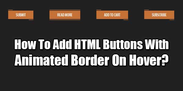
Its time to add HTML buttons with animated border on hover on your web page. If you a Web-Designer and want to create some awesome attractive web design then check out out ready to use HTML Snippet for Stylish border animated Button design to use it anywhere on the web.
There are many snippet available online or on many others Blog and website but every one is not able to optimize your blog or website so your need some optimized code snippet. So now checkout out code snippet for your blog and website that will give you all features for your desired code. Now grab the ready to use code and paste it where you want.
Table of Contents
Features:
1.) No JavaScript Added.
2.) No JQuery File.
3.) Simple HTML-CSS Added.
4.) Simple And Fast Loading Code.
5.) Can Work With Any Browser.
How To Add In A WebPage?
1.) Just Go To Your “Web Page File”.
2.) Now “Copy” The Below Codes And “Paste” It To There Positions.
3.) “Save” It, Now You Are Done.
HTML:
<button class="snip1582">Submit</button>
<button class="snip1582 hover">Read More</button>
<button class="snip1582">Add to Cart</button>
<button class="snip1582">Subscribe</button>
CSS:
.snip1582 {
background-color: #c47135;
border: none;
color: #ffffff;
cursor: pointer;
display: inline-block;
font-family: Arial, sans-serif;
font-size: 1em;
font-size: 22px;
line-height: 1em;
margin: 15px 40px;
outline: none;
padding: 12px 40px 10px;
position: relative;
text-transform: uppercase;
font-weight: 700;
}

.snip1582:before,
.snip1582:after {
border-color: transparent;
-webkit-transition: all 0.25s;
transition: all 0.25s;
border-style: solid;
border-width: 0;
content: "";
height: 24px;
position: absolute;
width: 24px;
}

.snip1582:before {
border-color: #c47135;
border-top-width: 2px;
left: 0px;
top: -5px;
}

.snip1582:after {
border-bottom-width: 2px;
border-color: #c47135;
bottom: -5px;
right: 0px;
}

.snip1582:hover,
.snip1582.hover {
background-color: #c47135;
}

.snip1582:hover:before,
.snip1582.hover:before,
.snip1582:hover:after,
.snip1582.hover:after {
height: 100%;
width: 100%;
}
Customization:
1.) Edit Your HTML-CSS As Per Your Requirements. Rest Is Ok For General Us. If You Are Pro, Then You Can Do Any Thing.
Last Words:
That’s all we have. If you have any problem with this code in your template then feel free to contact us with full explanation of your problem. We will reply you as time allow to us. Don’t forget to share this with your friends so they can also take benefit from it and leave your precious feedback in our comment form below. Hap


Be the first to write a comment.