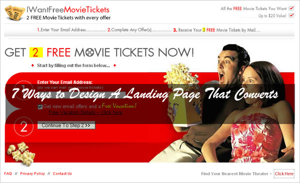
You are all set with the possible things on your marketing strategies and plans and they are working out too. You have perfectly designed your webpages, your paid search ads are well going, your ads on social networking sites are doing well and you are successful in receiving a lot of traffic for your website. You get so many visitors to your site, but still you cannot see any improvement in any other terms of your website.
For example, the situation is like this, many visitors are visiting your site, but none seems to be buying products from your site. Does this conclude that you are not doing well in the marketing side? It is not that actually. You must first check what your visitors do after clicking your ads. If the ads do not land in the perfect landing page, then what do users do and what is their mistake in this? Without having a good landing page, but promoting your website through ads in a better way is like getting ready to eat everything, but with no food prepared.
You should not just aim to make people visit your webpage instead, let them do some necessary action on your page. You must take care to make your visitors feel comfortable by including the necessary elements in the landing page that converts. You must take care of some factors for a good landing page that will be described here below. The following seven steps will help you in designing a good landing page, thereby helping you to get more actions from your webpage visitors for better business and profit.
Table of Contents
Call To Action (CTA):
The name itself indicates that what you have to do for a better landing page. Be clear in the action that you want your visitors to do. For example, Try! Sign up! Comment!Contact Us! Look into these pictures! Etc. You should let them know clearly, what they have to do to continue the further process on your website. The main point here is a perfect landing page uses only one CTA. You should not confuse them with unnecessary CTA’s. You can use some contrasting colours for the commands to seek the visitor’s attention to the exact place on your website.
Offer:
Offer simply means that offering them something for the actions that you want them to do for you on your webpage. You can call it as a gift, free offer, a best deal and more accurately, say in this case a free trial for specific software. If you try to give your visitors a best offer, then it will pull the visitors towards your side. However, you should consider that you should provide the offer for a limited time only to make them feel the rush for it. At least for the sake of getting the offer, they will try to complete the actions mentioned on your webpage.
Include Social Proof:
Proofs are important to make other believe about something you do. For example, you are collecting money for a cause and for that you are getting donations from people. Some people may be ready to donate you the money, but some people will not be ok for that and they ask you some proof for it. If you show them the bill or the sheet that others have signed as an acknowledgement for the donation, then they will believe you and offer you the donation. This is the normal process and it is applicable to here too. If other people have approved a thing, then it is valuable and genuine. This is the general state of mind of a common person. Therefore, get some valuable evidences for your webpage like other user’s comments, feedbacks etc. and include them on your webpage for the visitors perusal.
Avoid Visual Clutters:
It is a good idea to display some attractive visuals on your site, but if it too much distracts the attention of the visitors, then it will become an issue for you. For example, if there is an image that assures people can get six pack abs through some simple steps, then people will certainly fall for it. Having such visual ads is not a good idea. Instead, just focus for having more white space in your website with clean and clear content. Use big and clear fonts to compel the visitors to go through the content of your webpage. Include necessary videos that can convey much more than the texts. Use bullets, if necessary.
Take Care Of Resolution:
Not many persons care about the resolution of their computer, but still there are so many people available in the world who uses PC on low resolution and do not know about how to deal with it or how to change it to better resolution. You must understand that what you see on your PC screen is never going to be the same with what all type of your customers see on theirs. Therefore, it becomes necessary for you to design the important contents of your landing page within the coverage area of a normal low-resolution computer.
Have An Attractive And Productive Headline:
A funny, clever or an extreme headline will catch the attention of the user. It is something like distracting the visitors from what they are looking on and drawing their attention towards you. You have to make them sit for a while on your website and let them browse on your website about what you have in your store for them. Your headline is going to decide whether the visitors will go back to their previous task or going to stay with your site for further surfing. Therefore, prepare the headlines with too much of care and attention.
Get Directly To The Main Content Of Your Website:
People are not so patient to read the full stories on your website. They always look for what they want in your website. They just have a quick browse of your website content and if they find something useful or related to their need, then they will stop by and start to read. In any other cases, they simple move on. This is the case with very few people and most of the people are not patient enough to have even a quick peek of your website content, if they cannot find the useful content at the very first line of your content. Therefore, take care to include only useful content on your webpage.
This article is the creation of Jane from Texas, USA. She is a freelance web designer and content manger currently associated with Iflexion Company where she designs perfectly converting websites.


Great post. SEO, as you mentioned, can turbo-charge your growth and catapult you to the top of your field. Tips on how to accomplish this without losing your shirt are always appreciated. Thanks for sharing.
Welcome Here And Thanks For Liking This And Leaving Your Views For Our New Comers, Be With US To Get More…